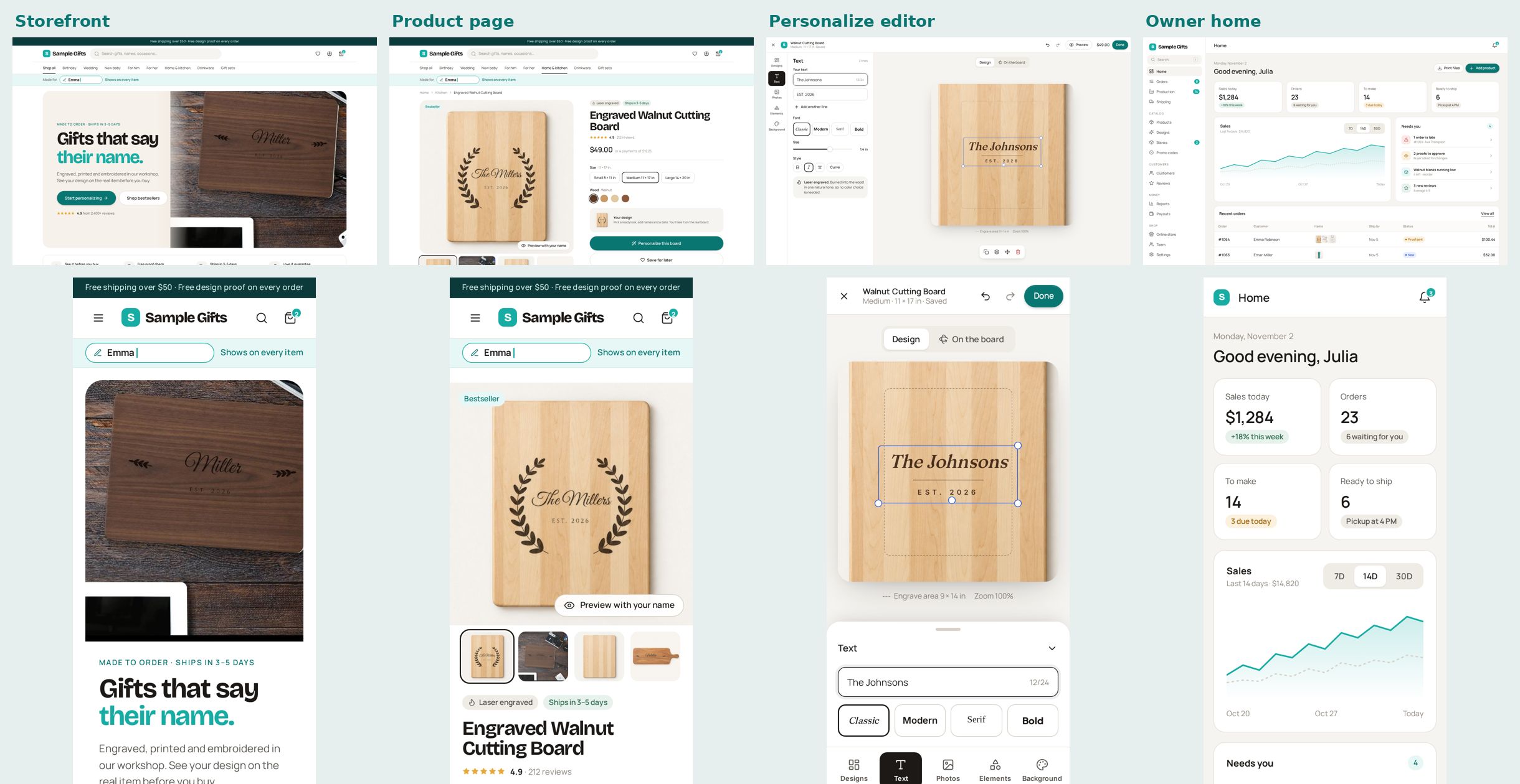
Original A layout + turquoise + new font
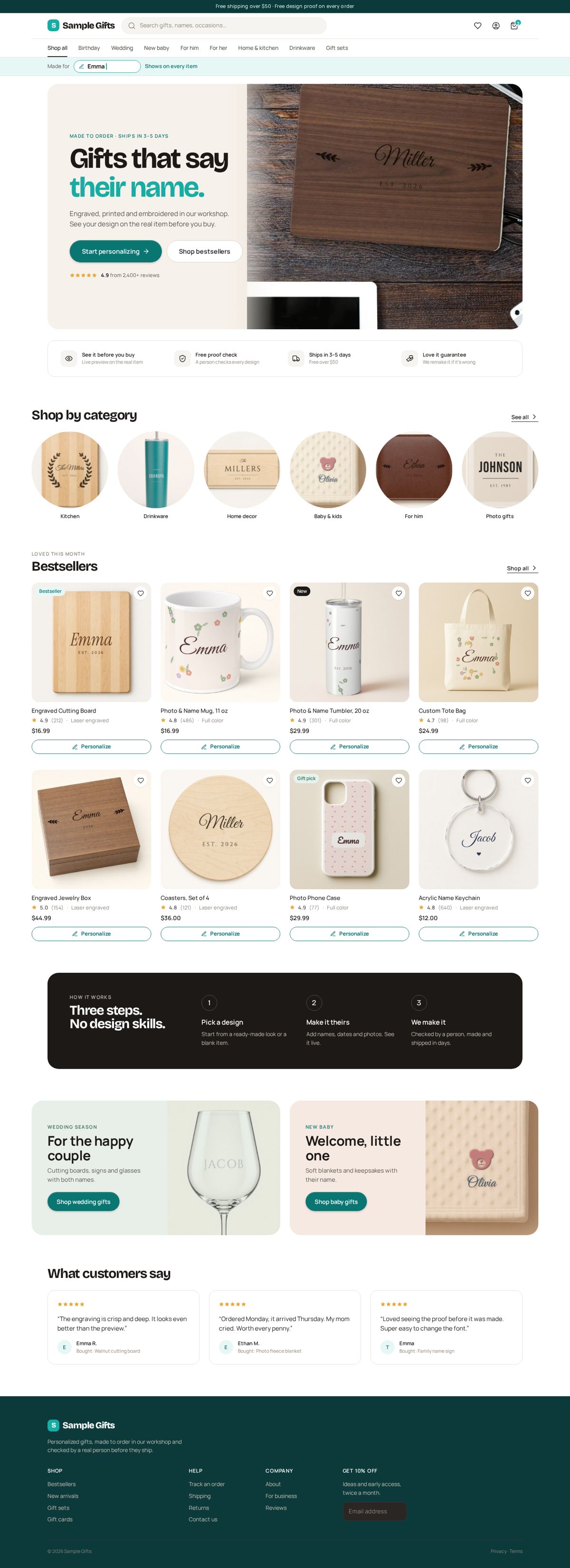
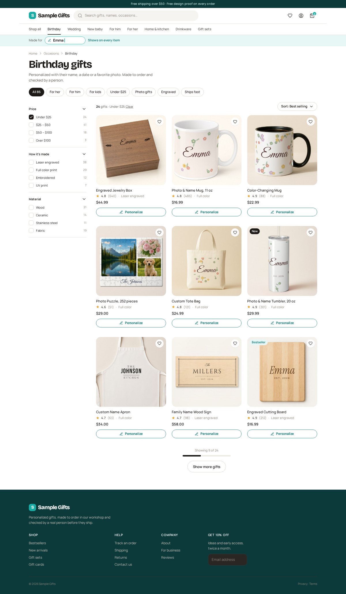
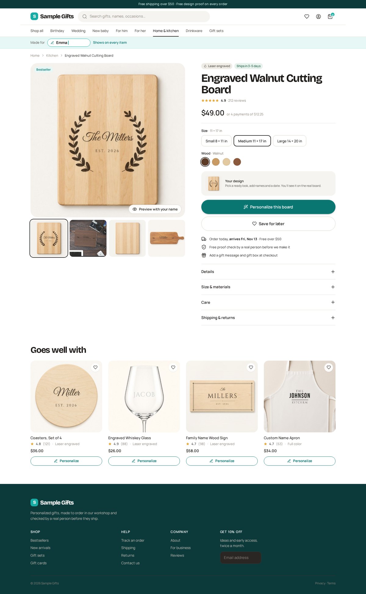
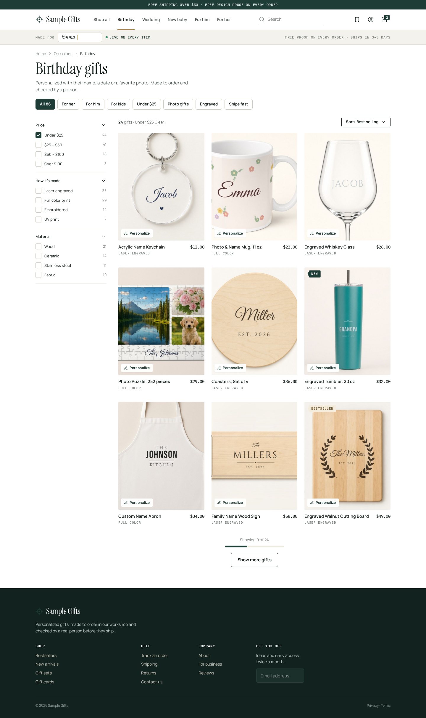
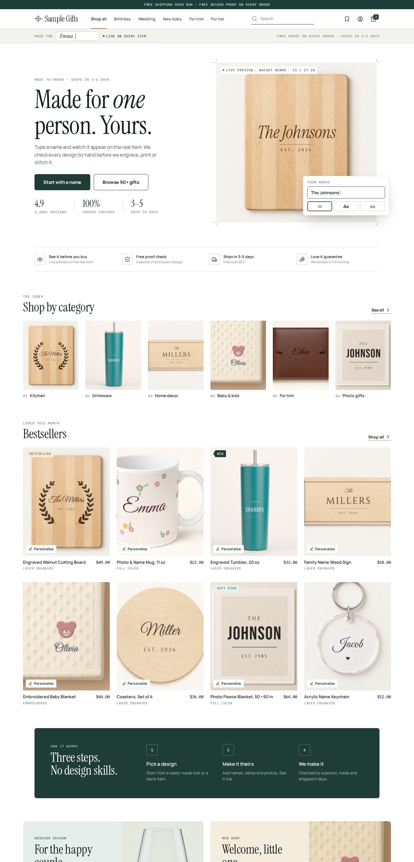
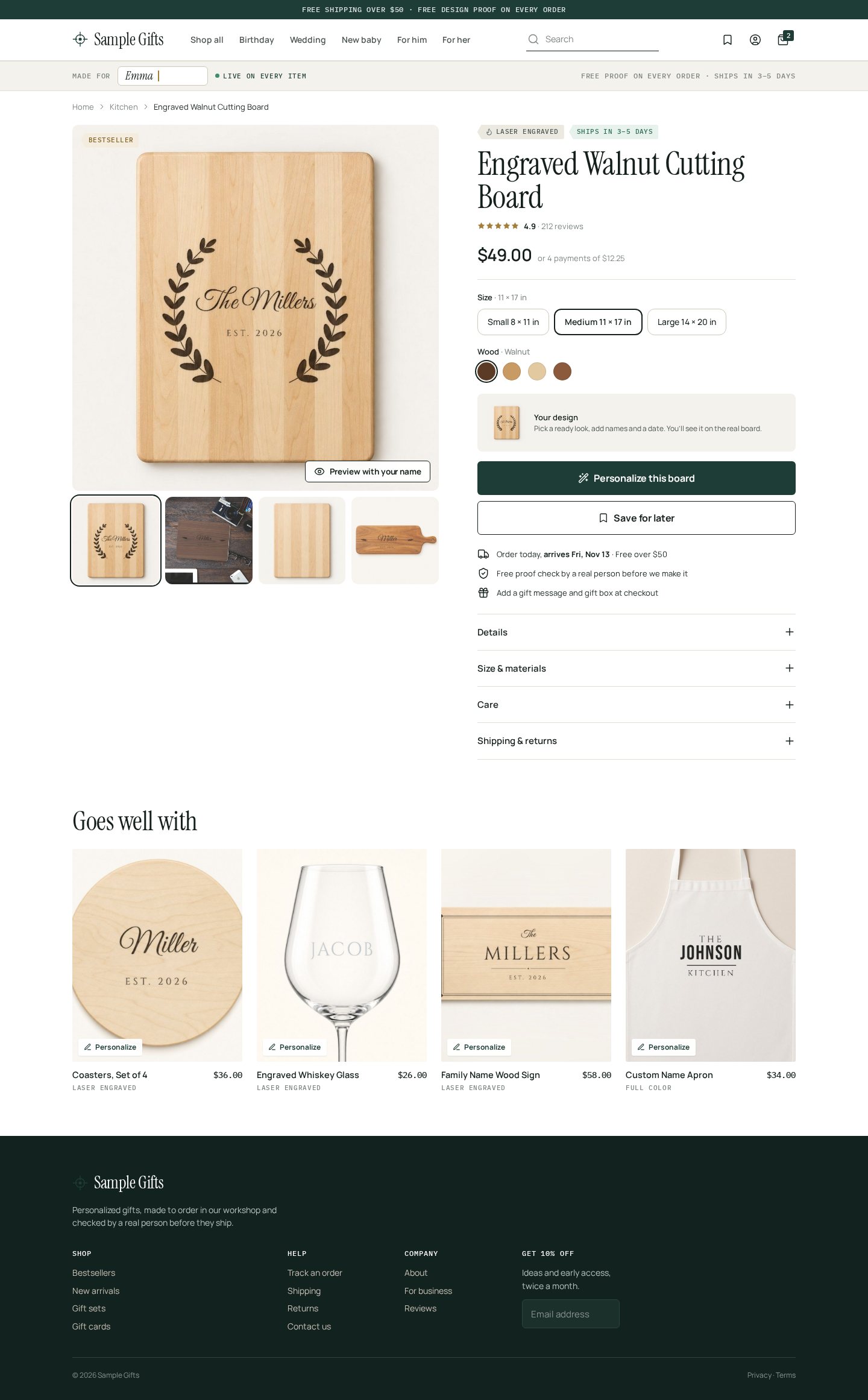
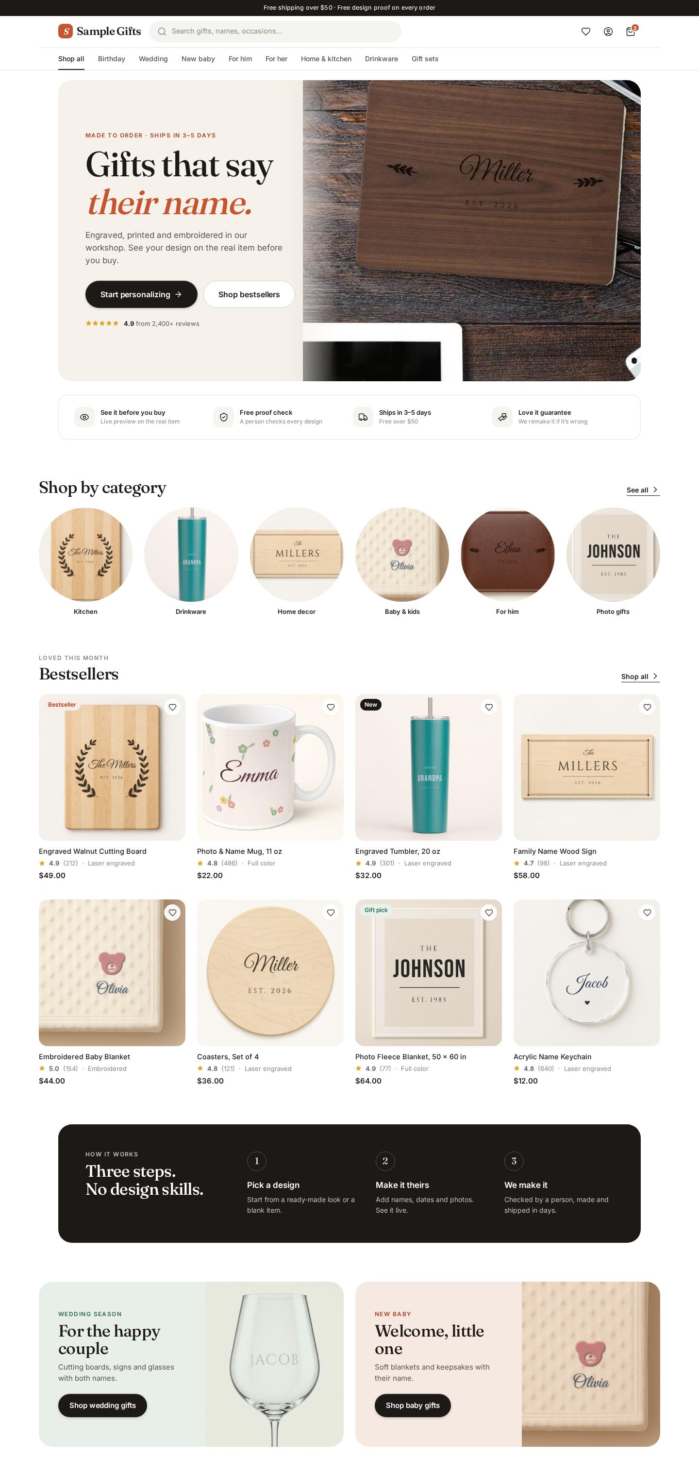
Every product card has a clear Personalize button, and the small “Made for: Emma” strip shows the buyer’s name on the items.
Mockups only. Nothing on the live store has changed. Tap any picture to see it full size.
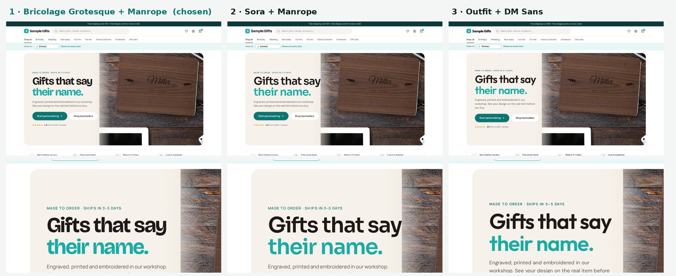
Fonts we tried
Three modern headline fonts on the same home page. We picked #1.
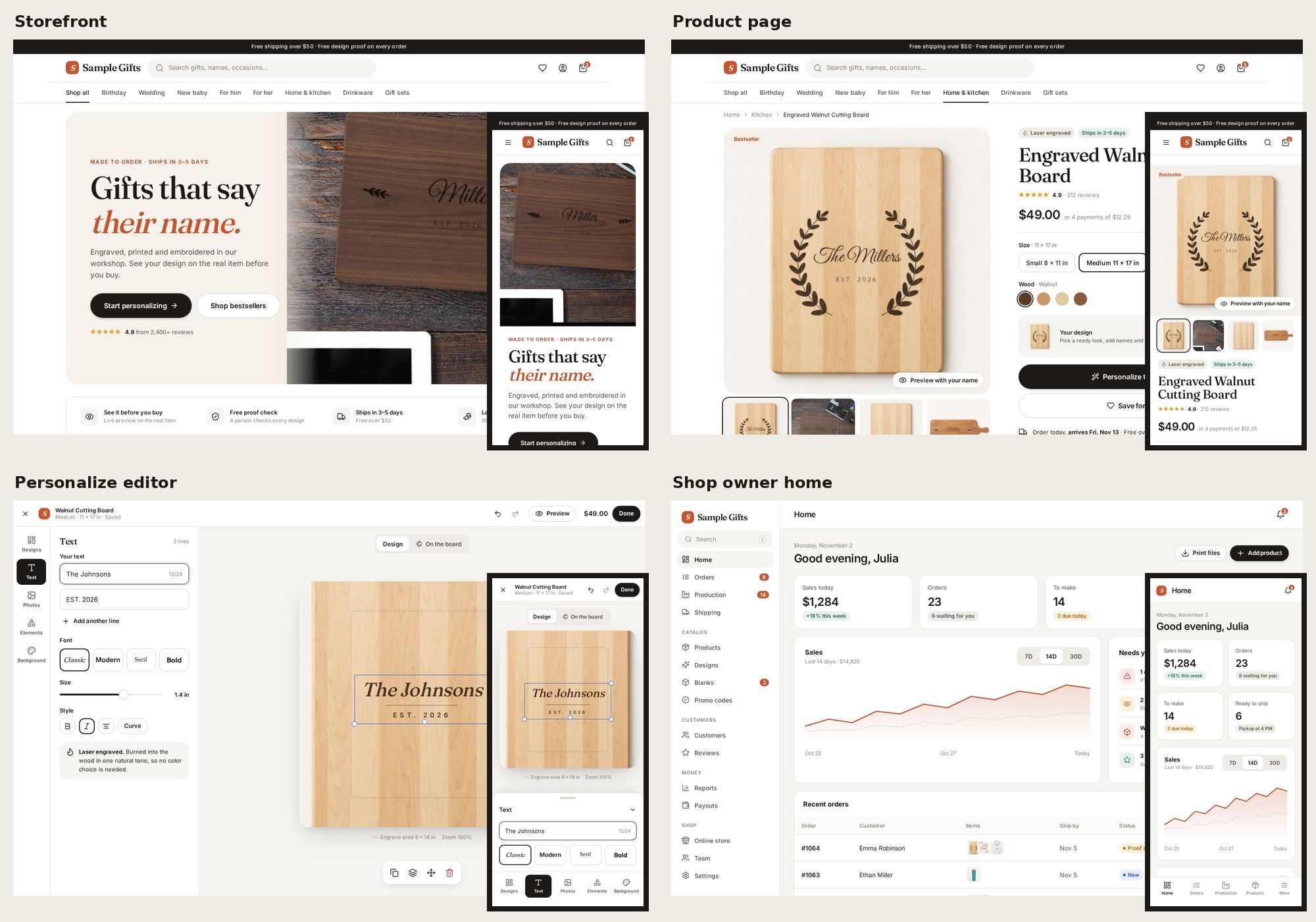
Storefront home

Category list

Product page

Personalize editor
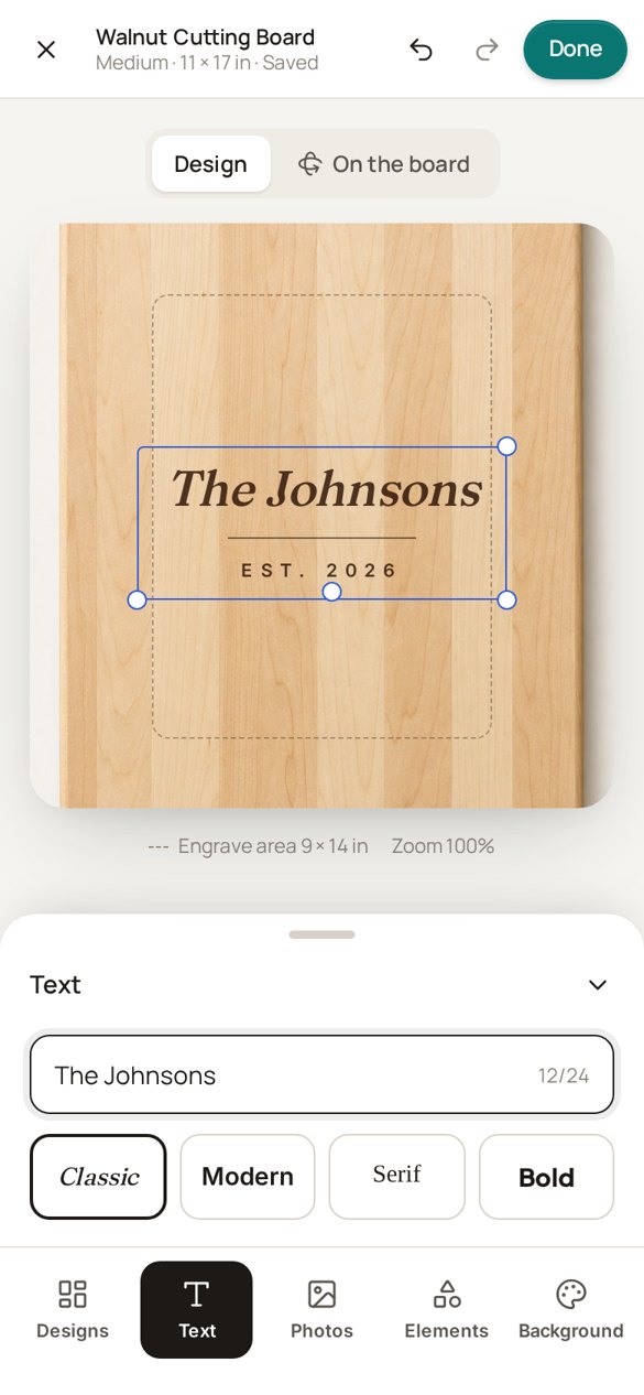
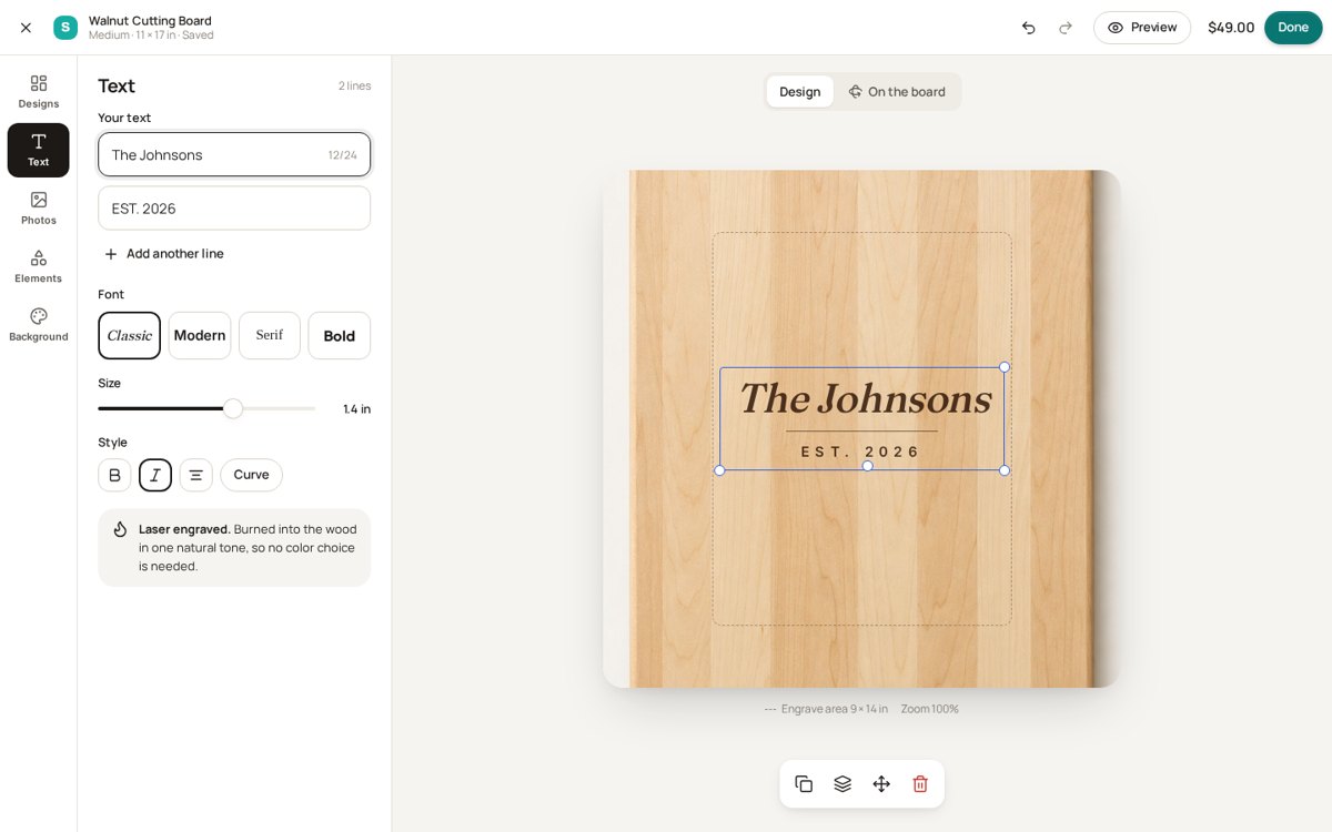
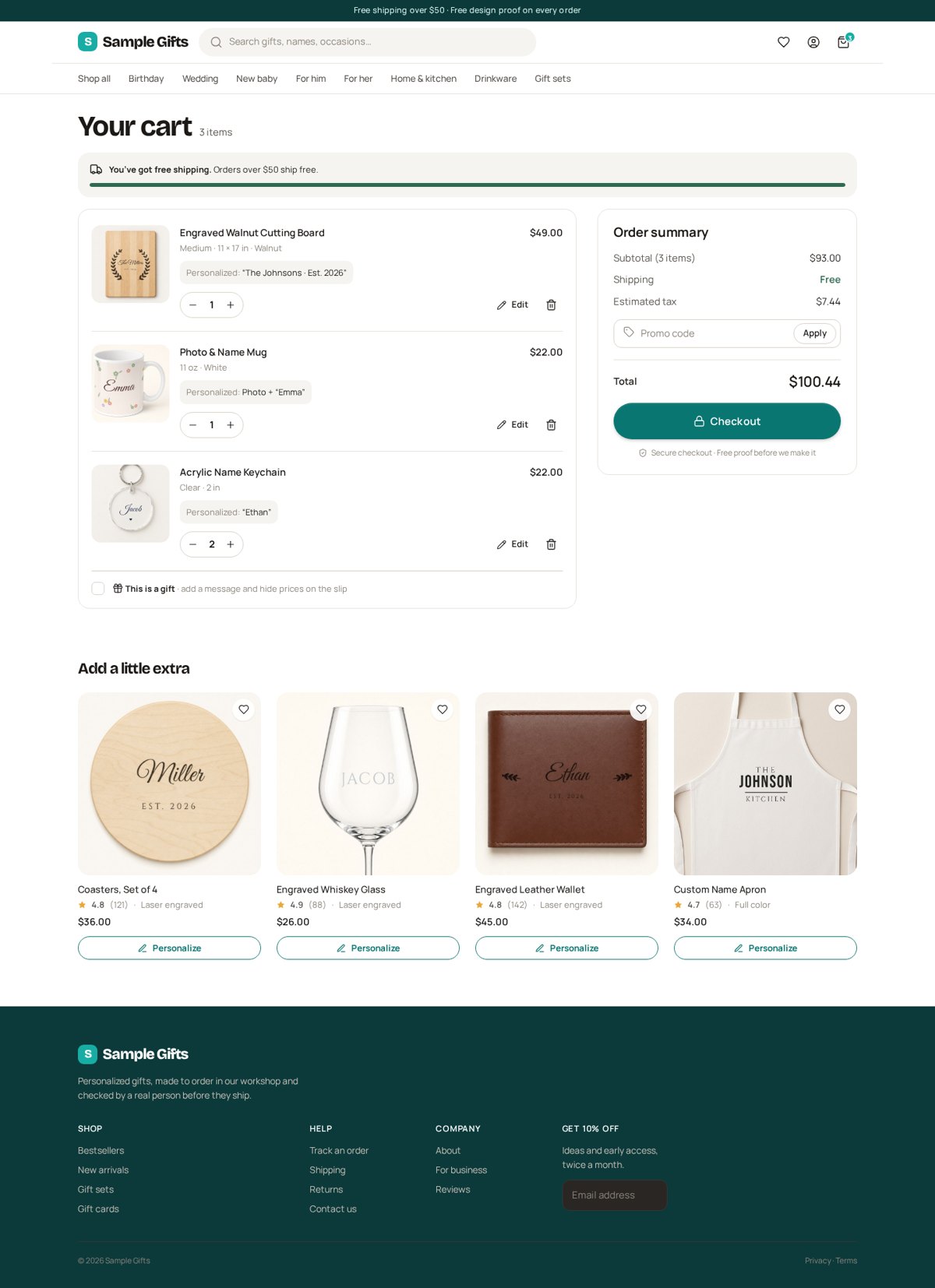
Cart

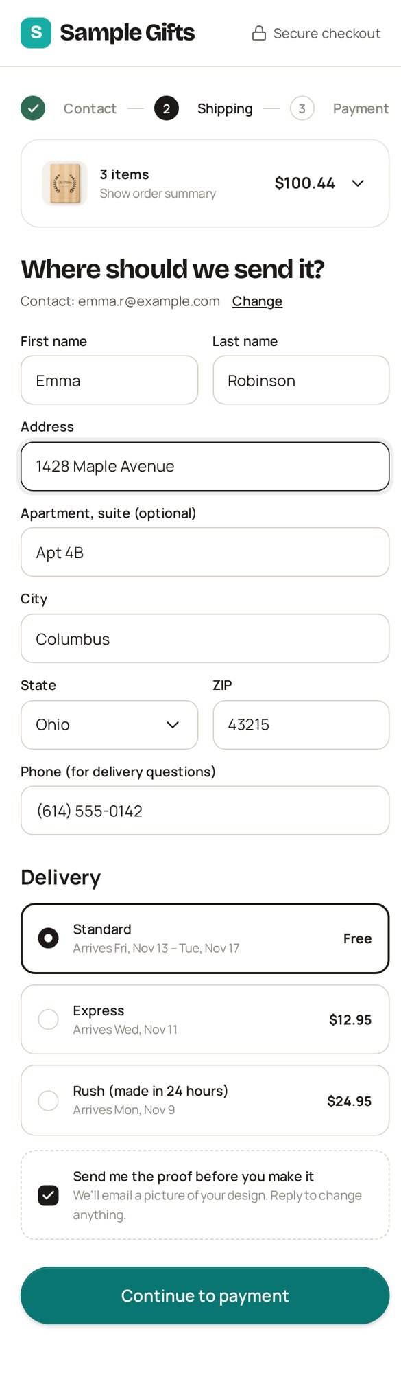
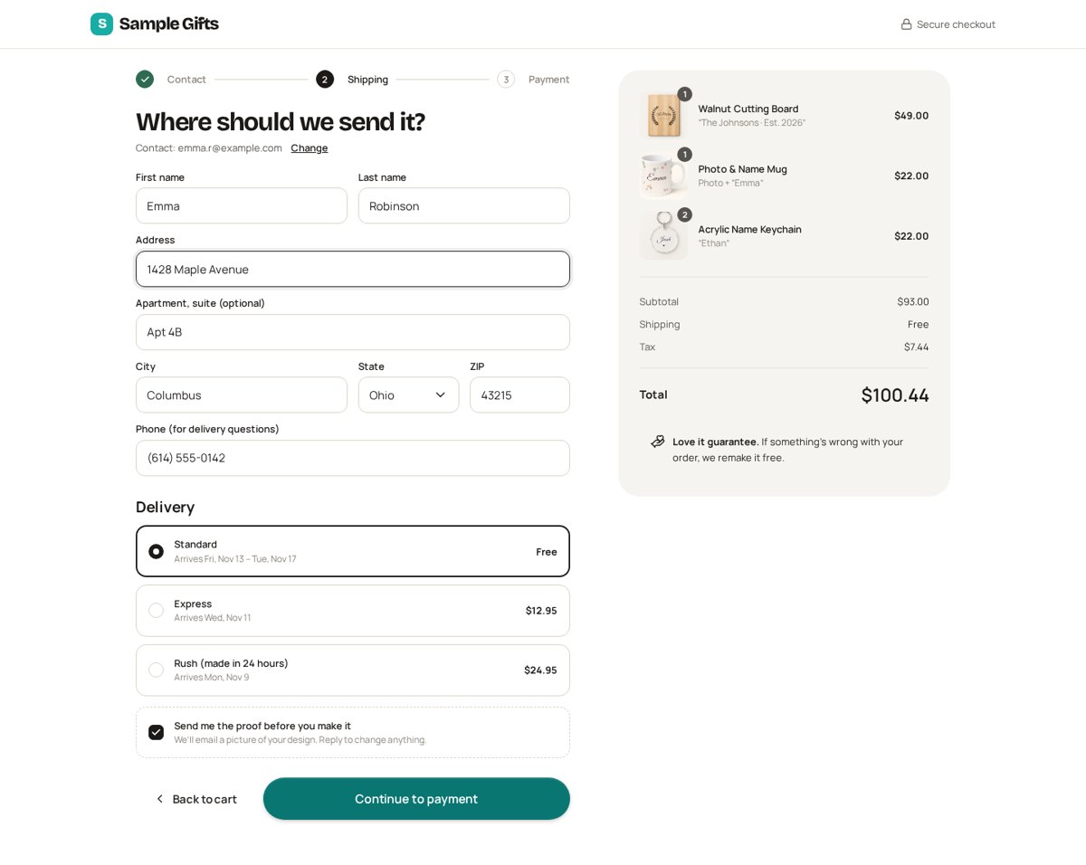
Checkout
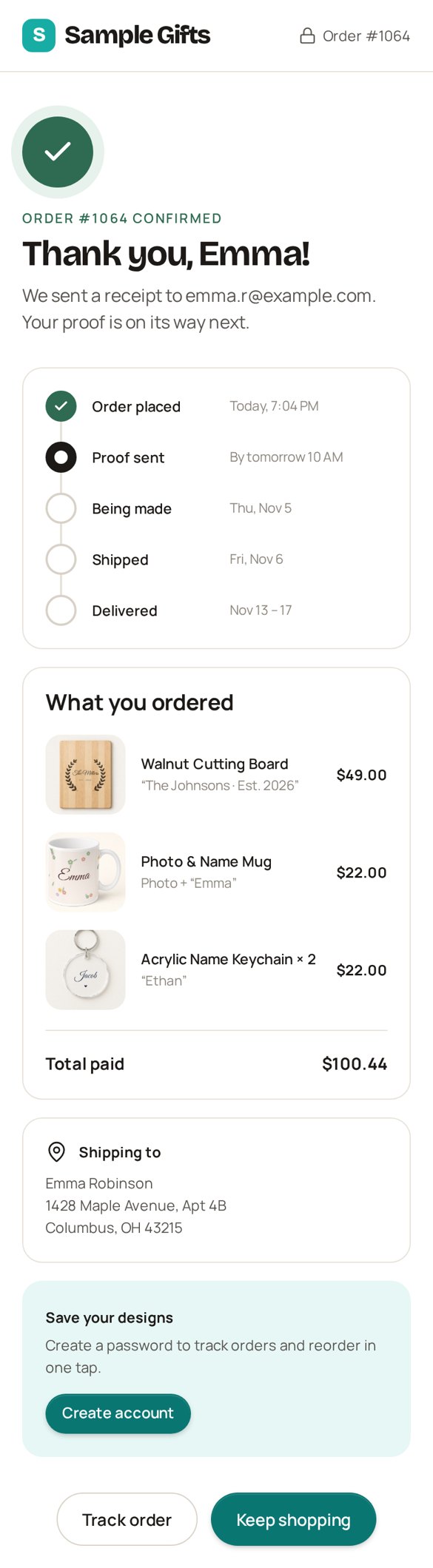
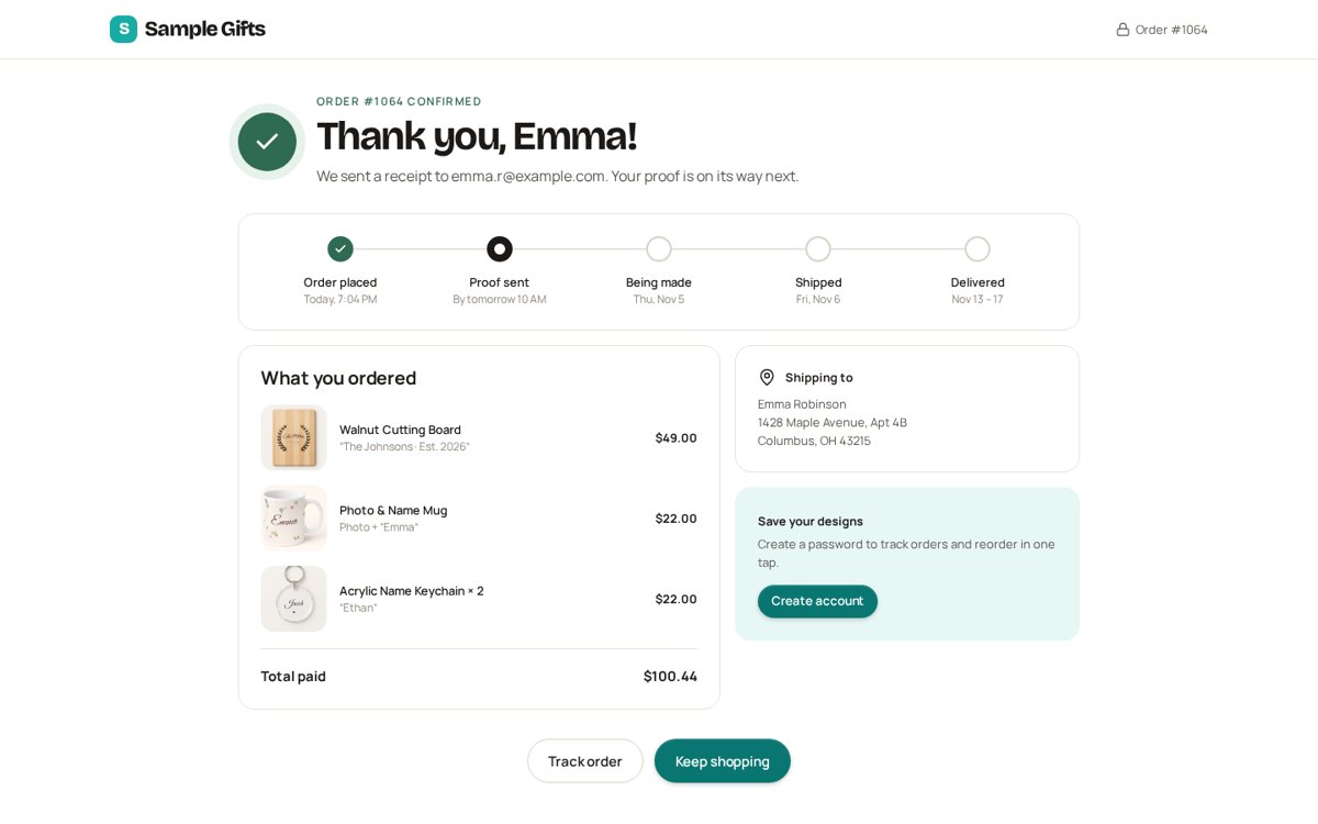
Order confirmation
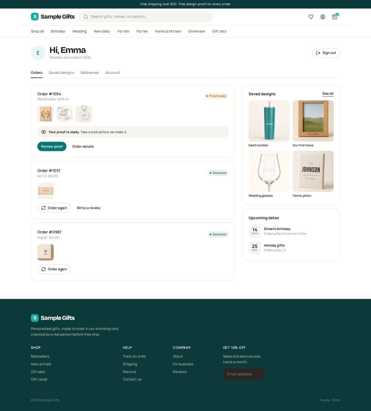
Buyer account

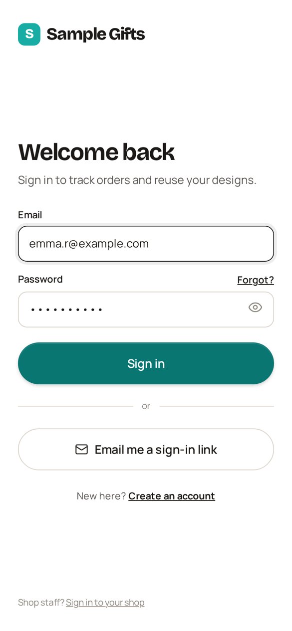
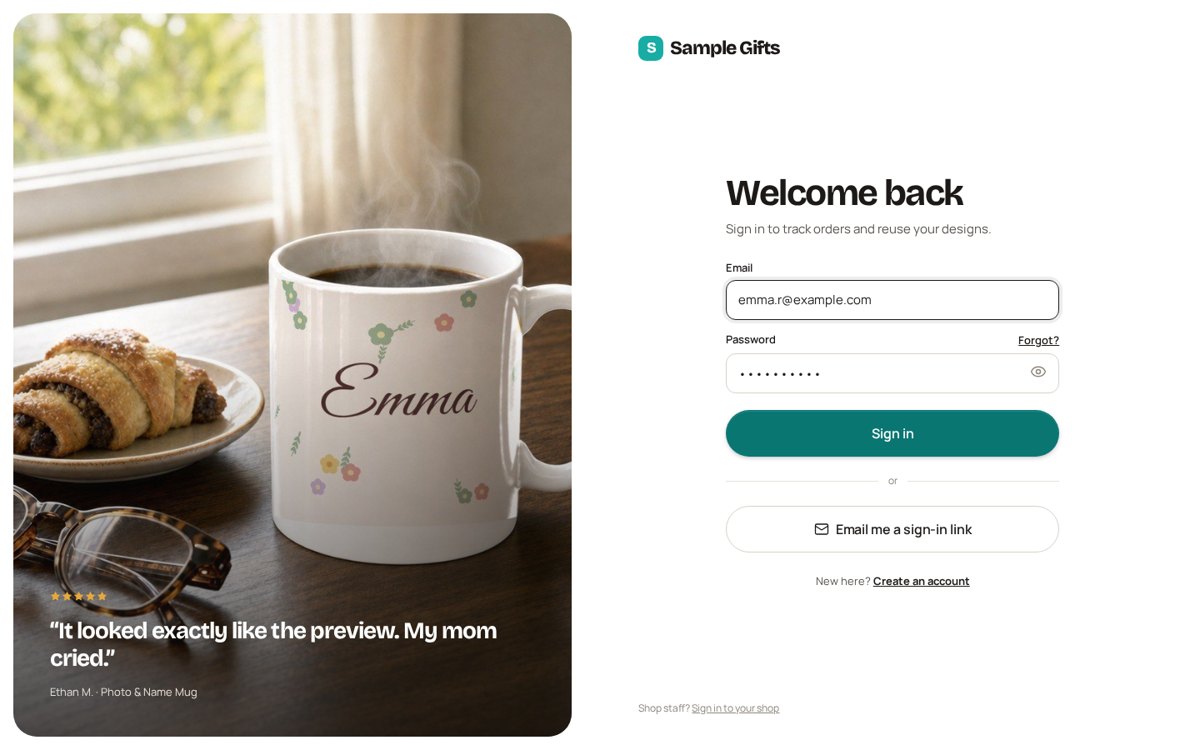
Login
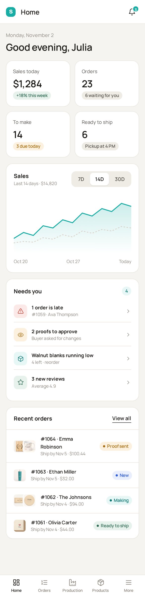
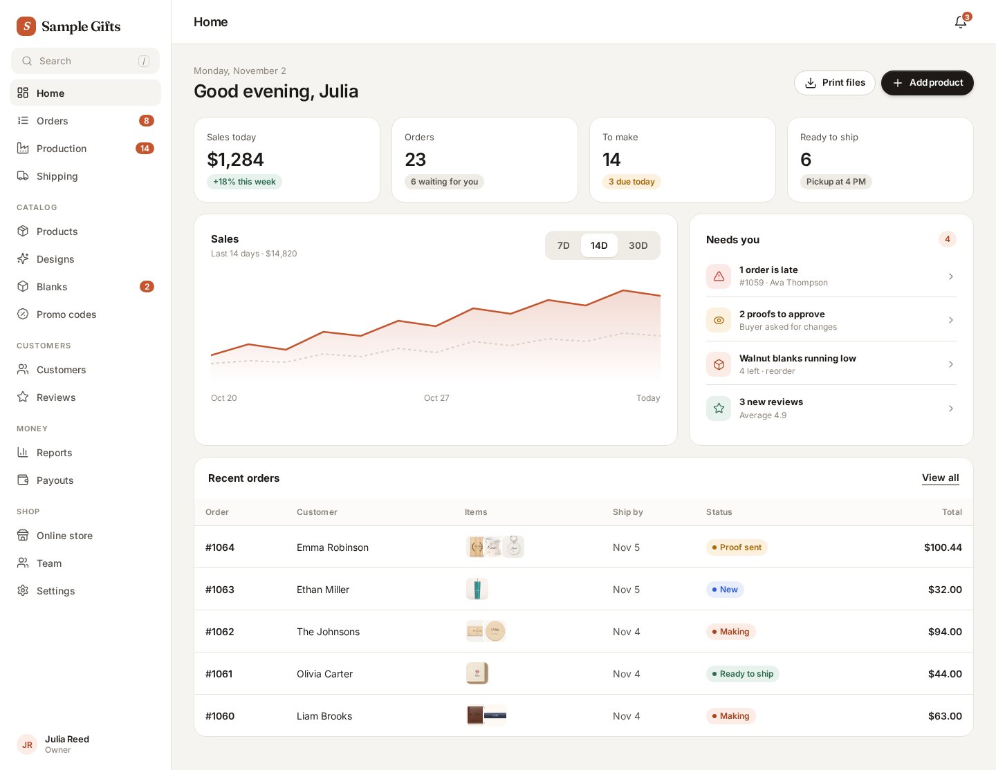
Shop owner home
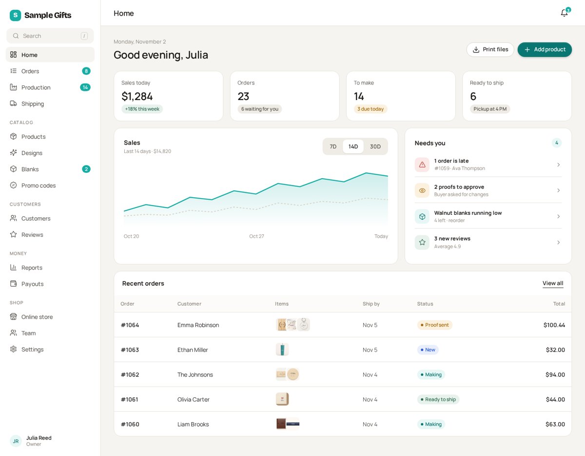
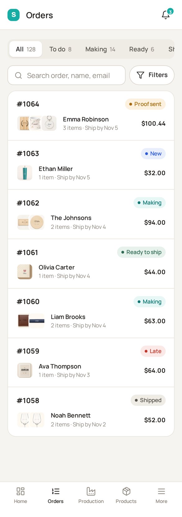
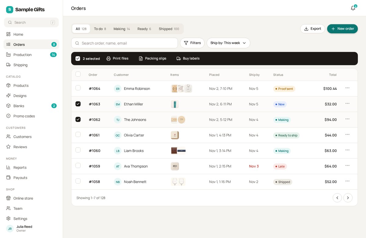
Orders
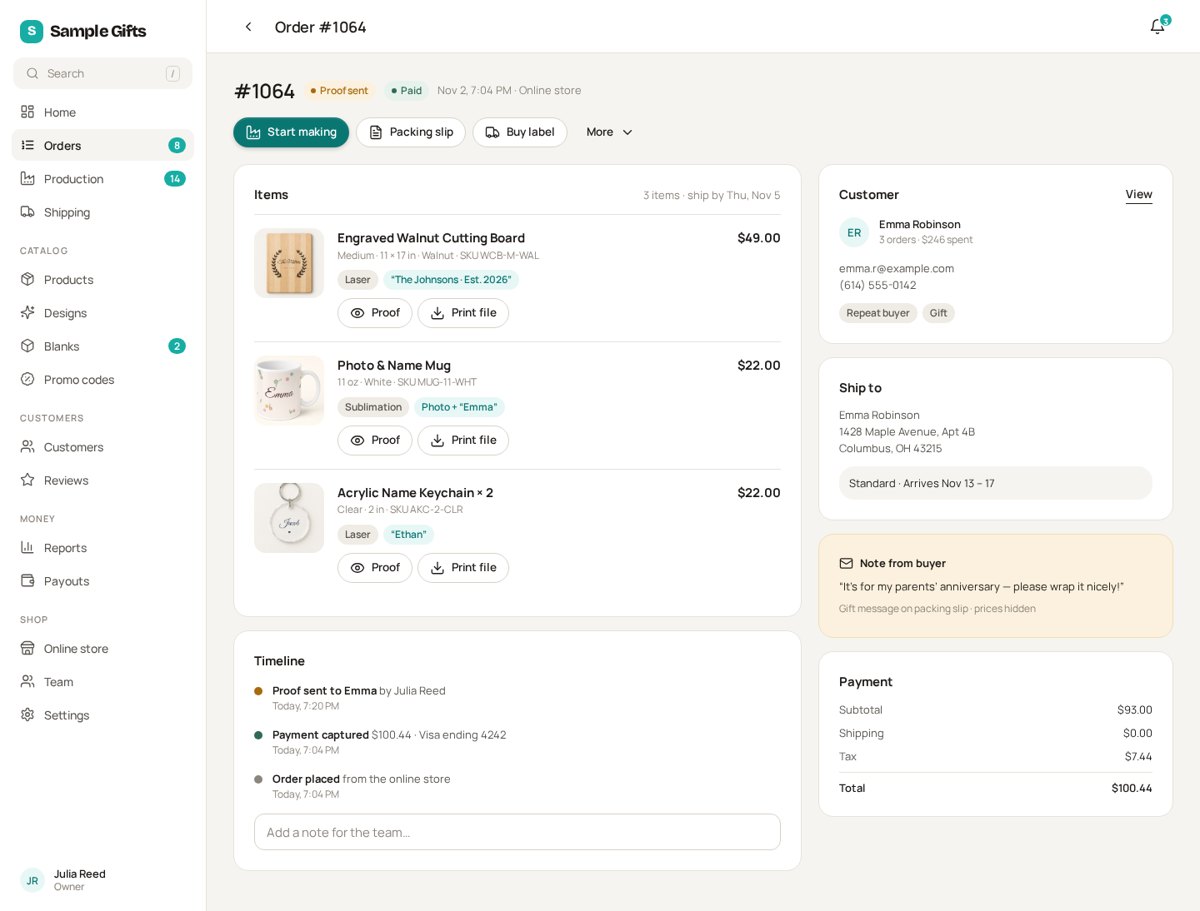
Order page

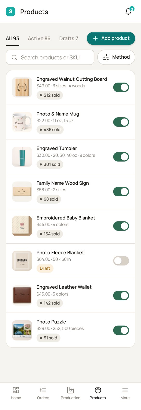
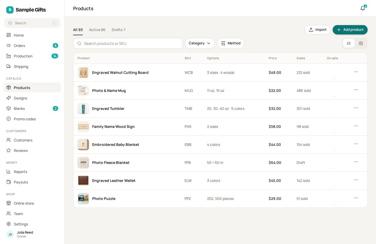
Products
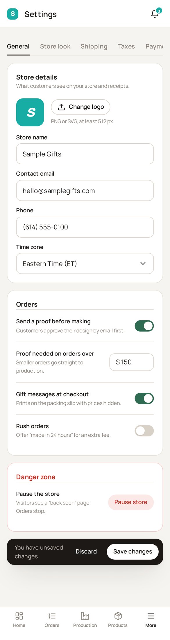
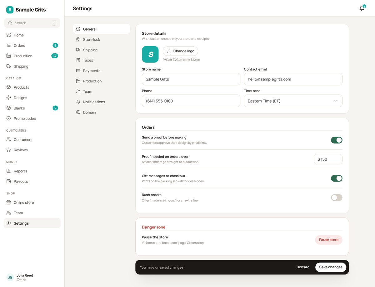
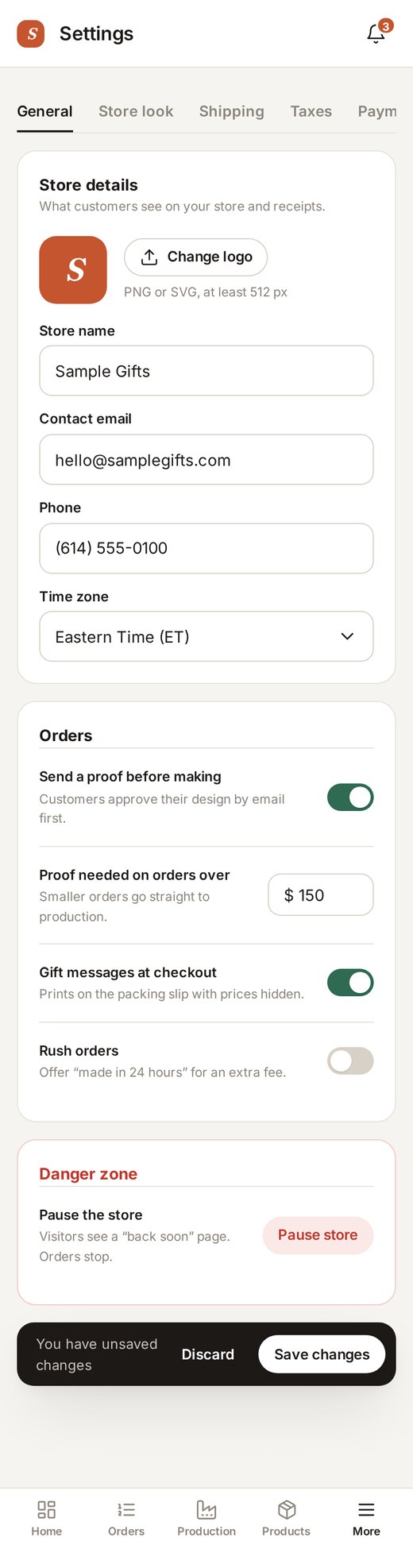
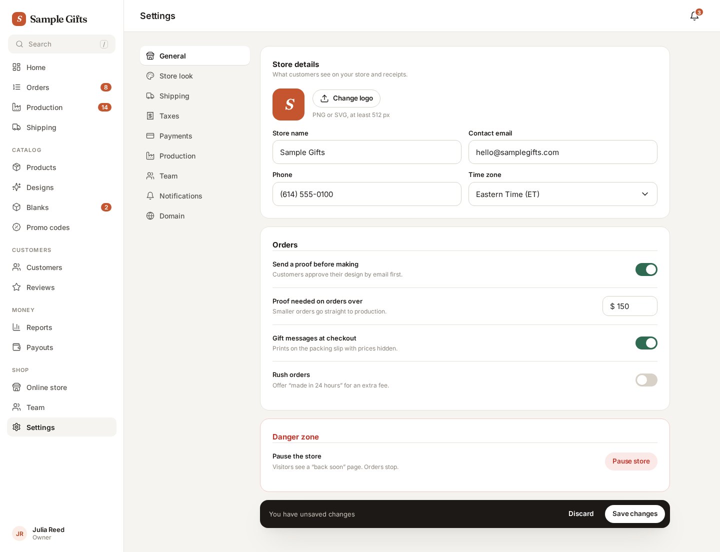
Settings
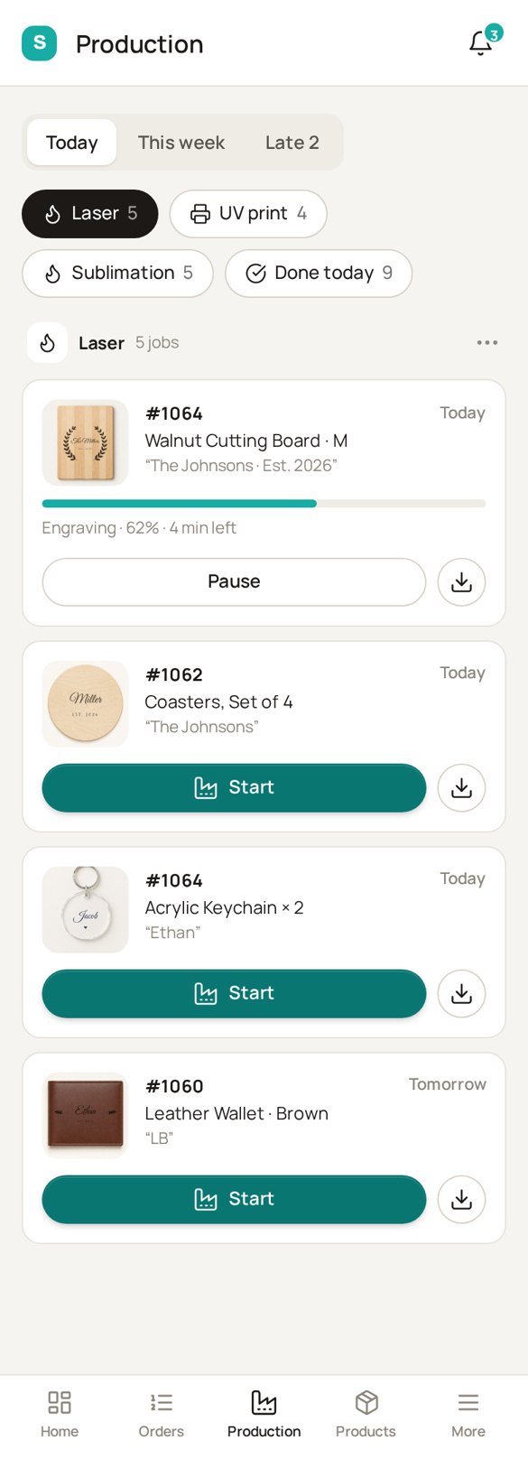
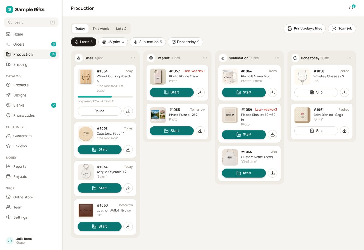
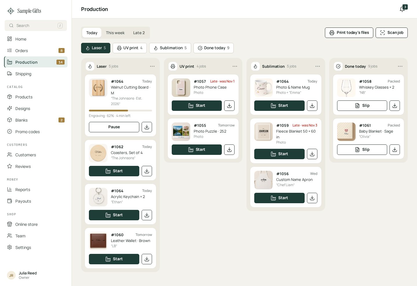
Production / workshop
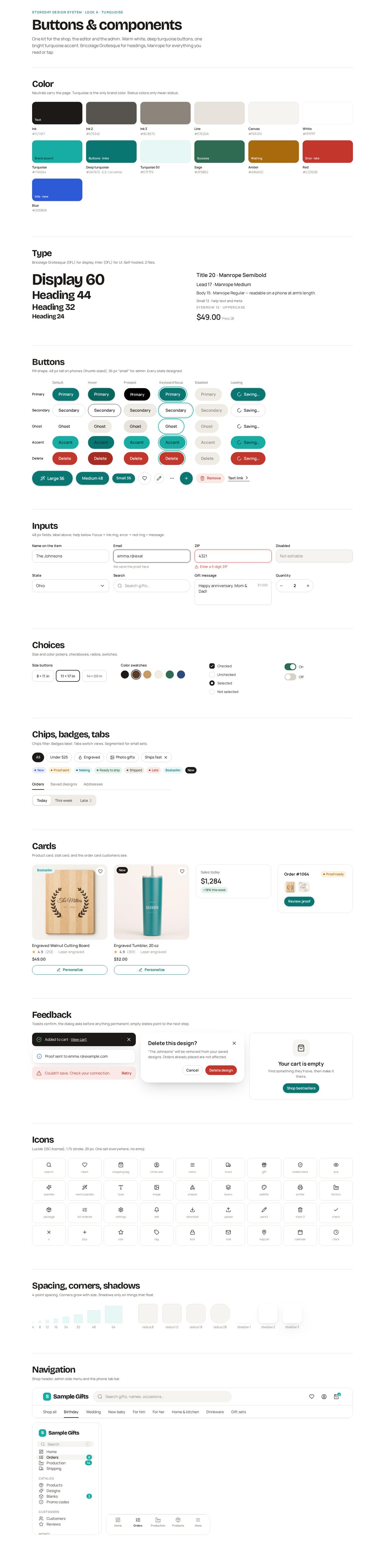
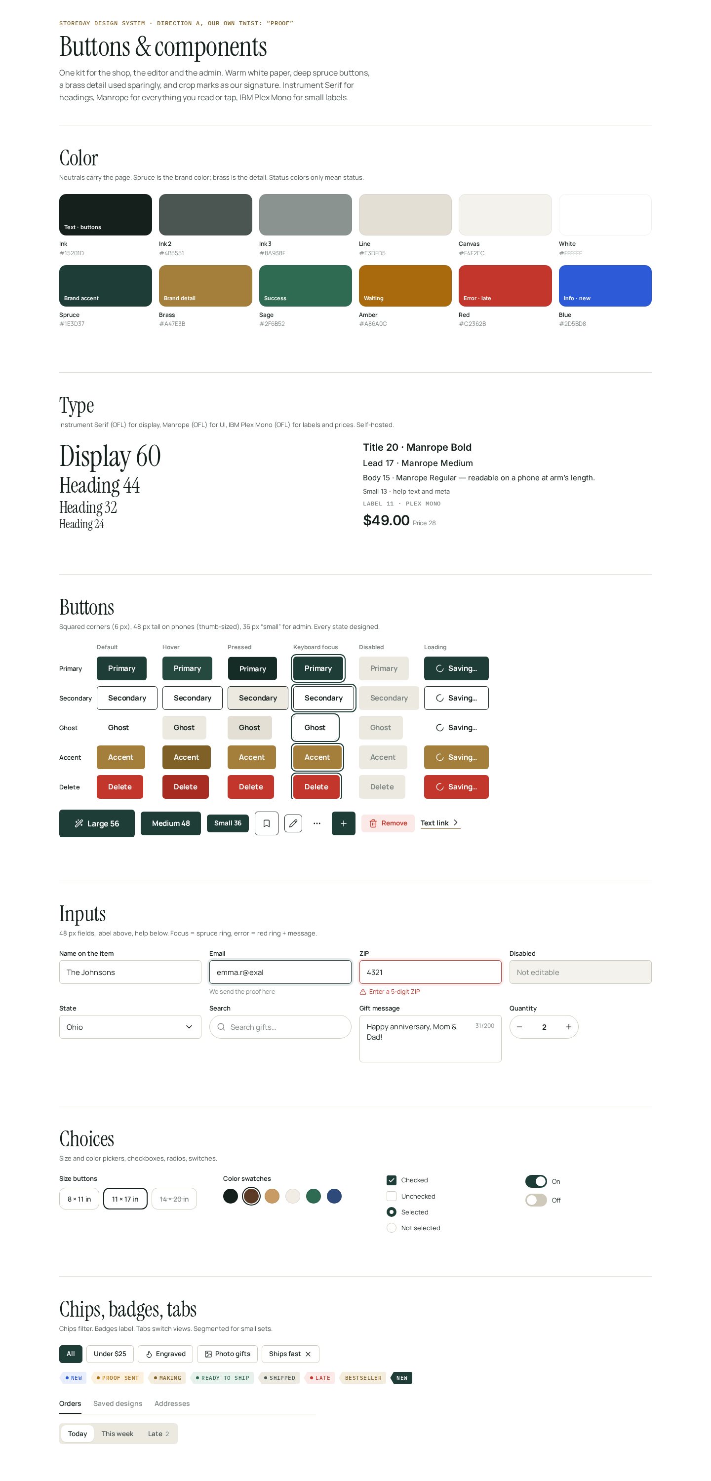
Buttons & components

Green version
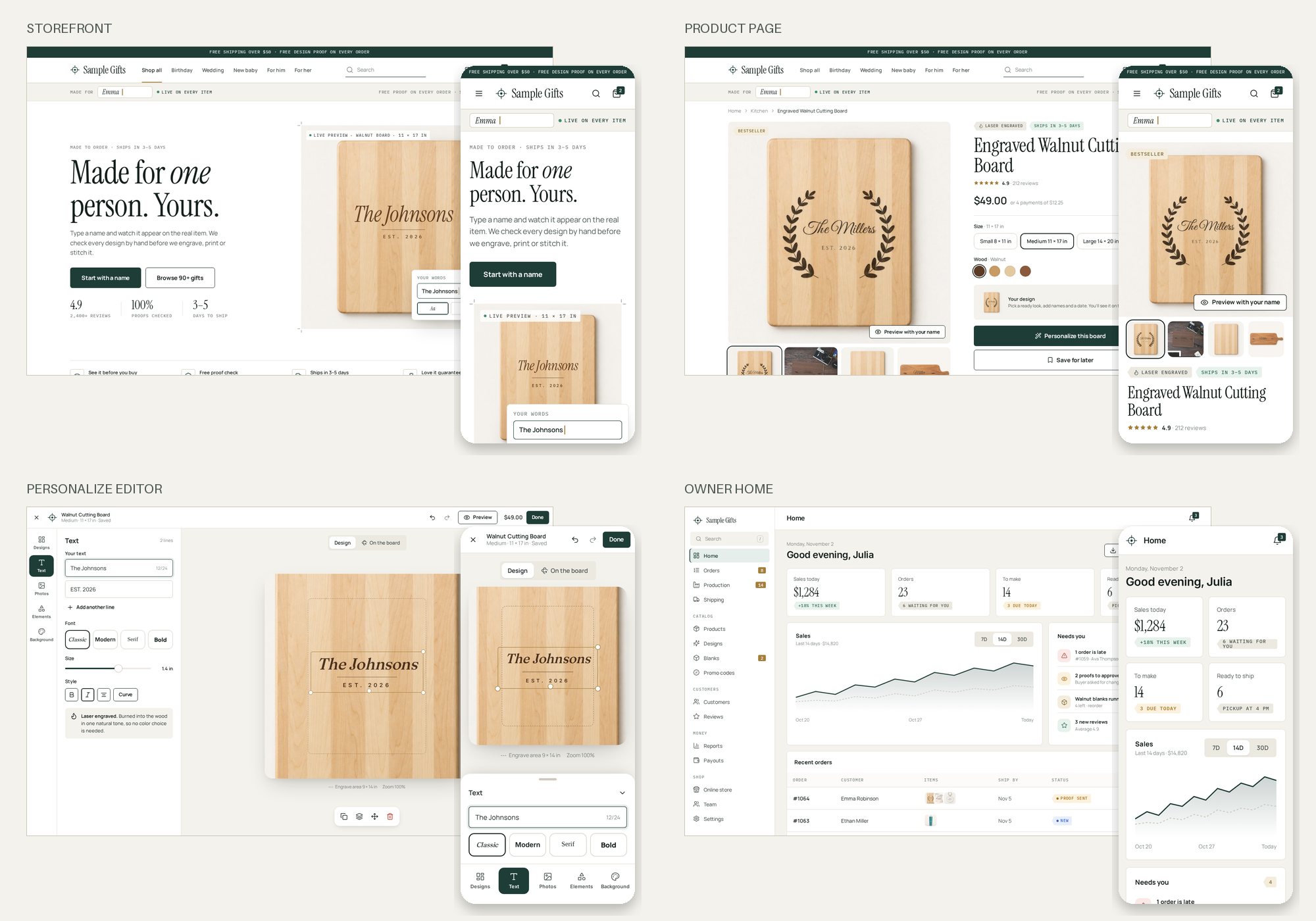
Look A, made our own (deep green + brass).
Same calm, premium Look A you liked, with its own identity so nobody says “this is Etsy.” Mockups only. Nothing on the live store has changed. Tap any picture to see it full size.
What changed so it’s not Etsy
- Color: Etsy’s orange is gone. Our color is now a deep spruce green, with a small brass detail.
- Shapes and type: squared buttons and price-tag badges instead of round pills. New fonts (Instrument Serif and Manrope), plus small typewriter-style labels for sizes and prices.
- Header and cards: no big round search bar and no row of category circles. The menu sits next to the logo, categories are numbered tiles, and product cards show a “Personalize” tag instead of hearts.
- Our own signature: printer’s crop marks, a “Made for: Emma” strip under the header, and a home page where the buyer’s name appears live on the real item. Etsy doesn’t do any of this.
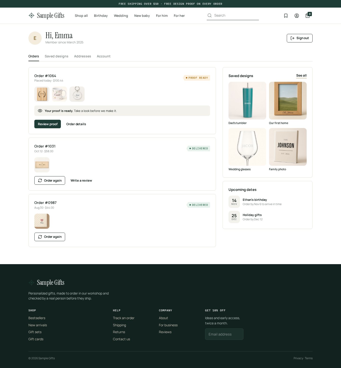
Buyer account

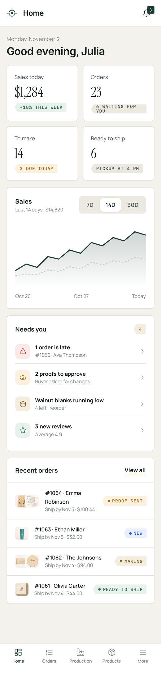
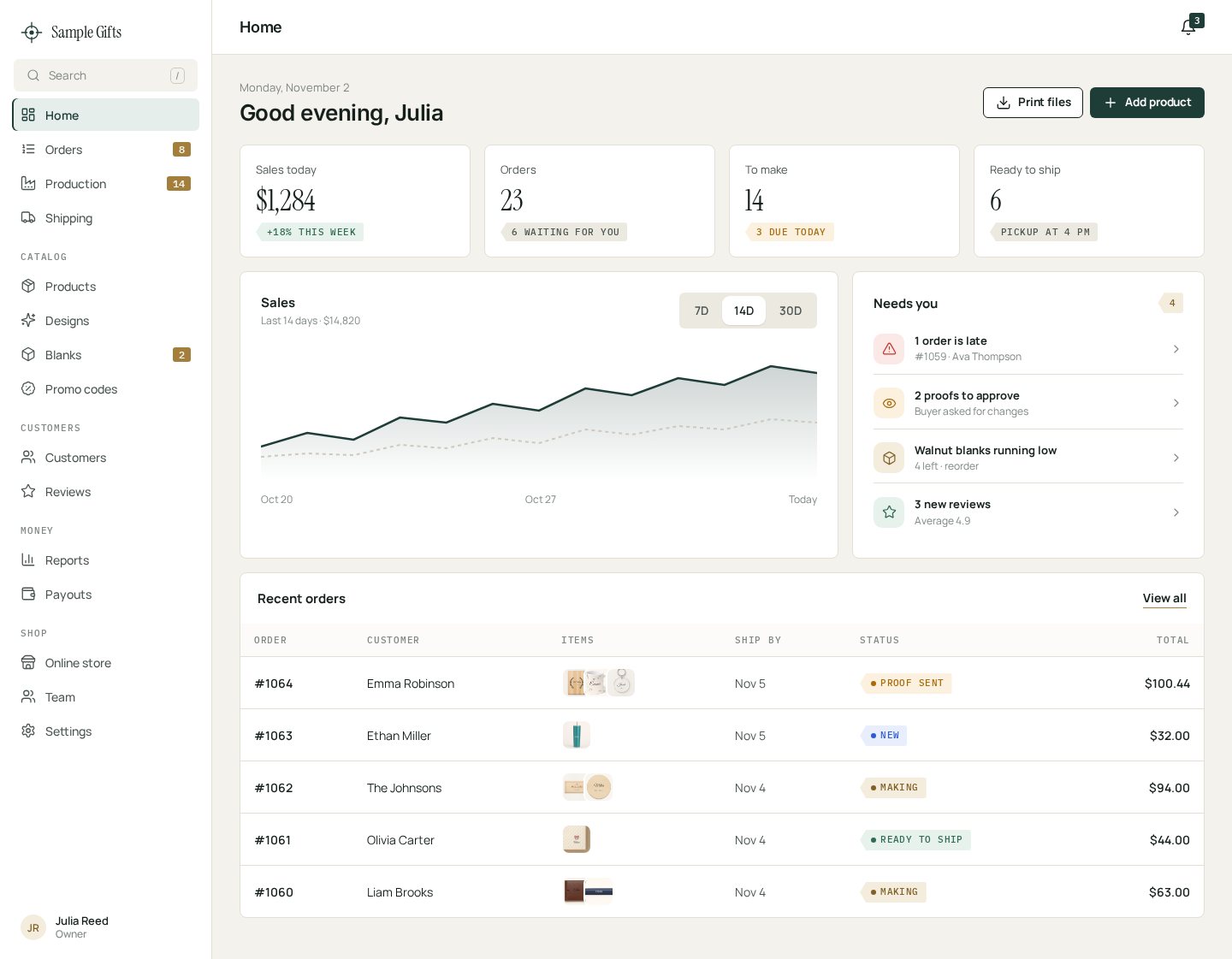
Shop owner home
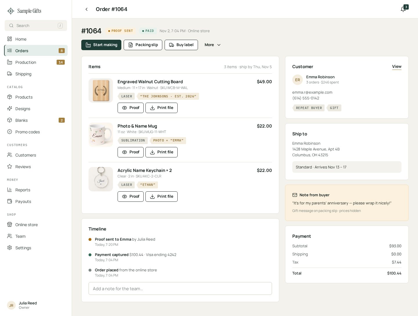
Order page

Orders
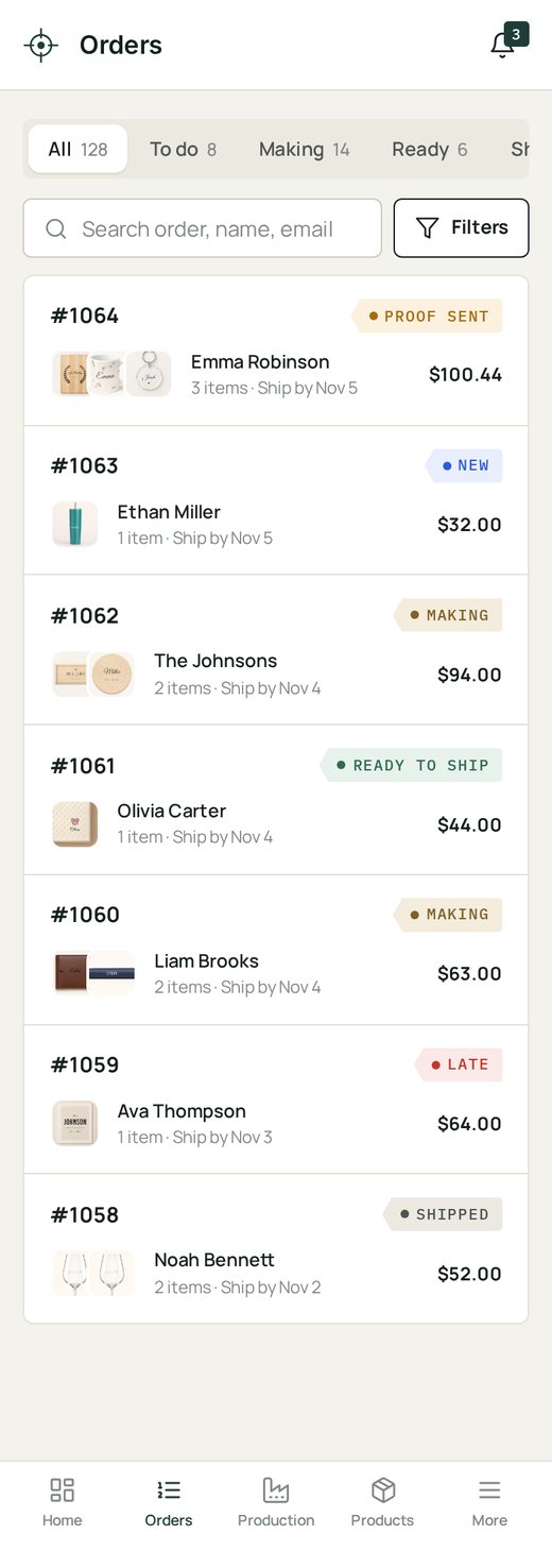
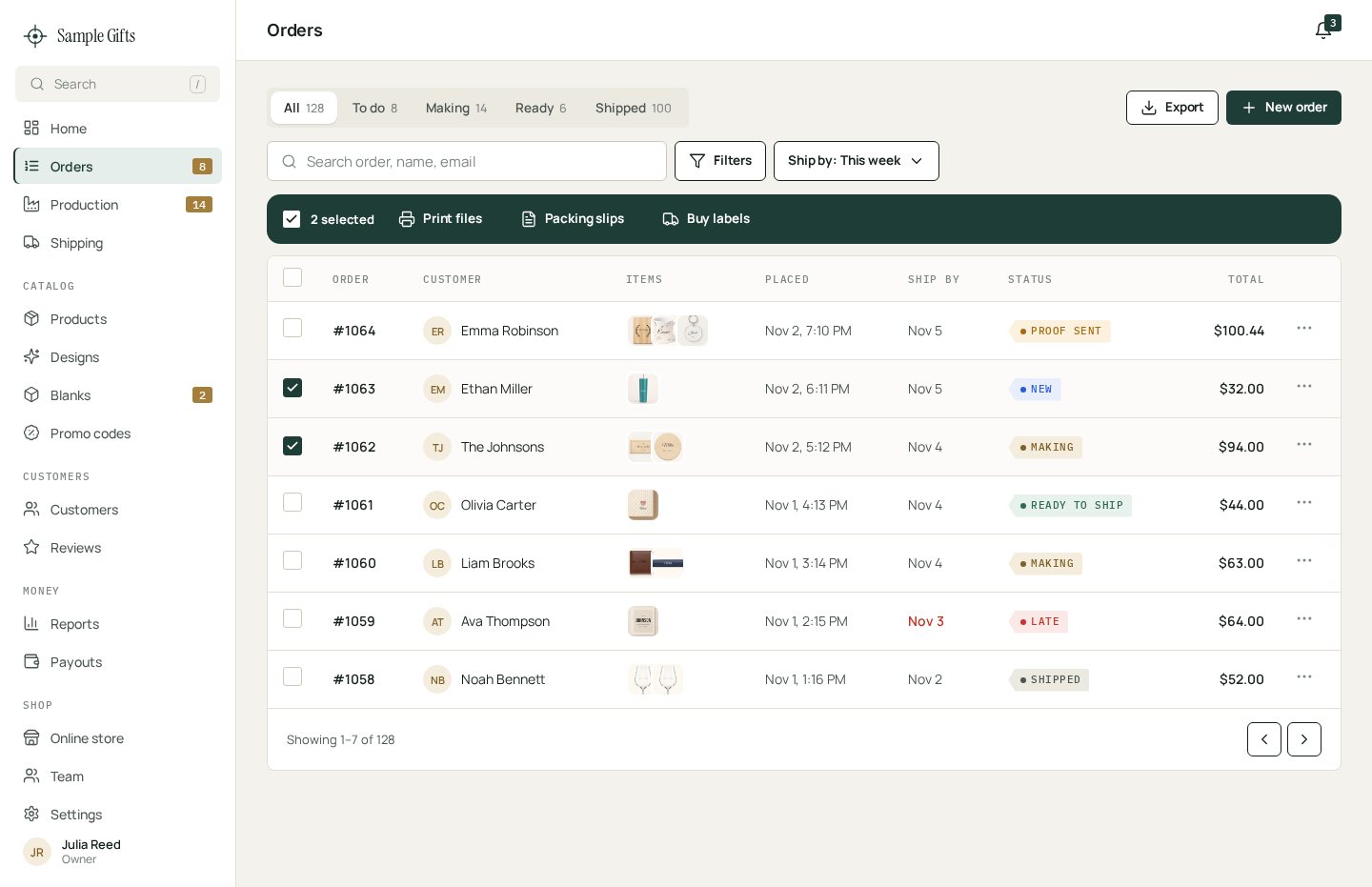
Products
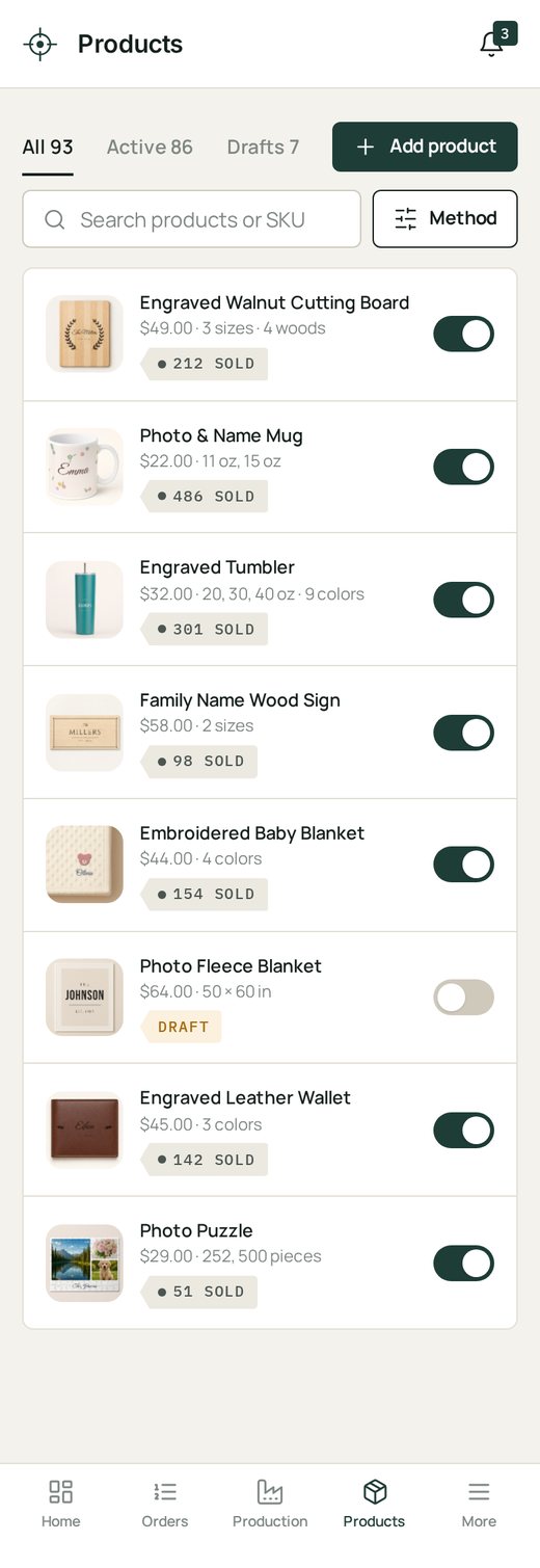
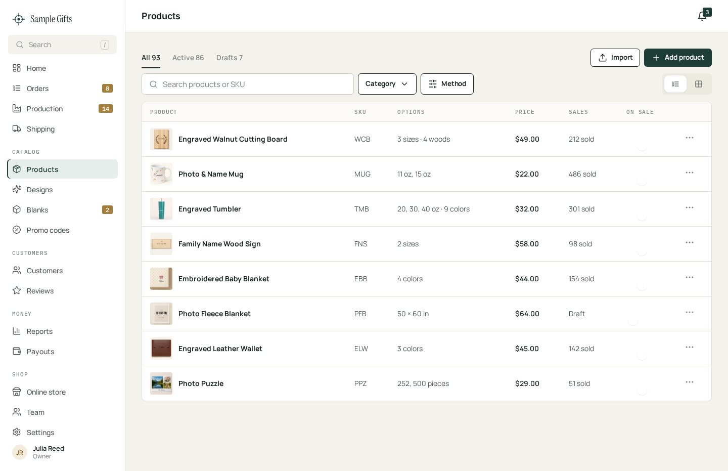
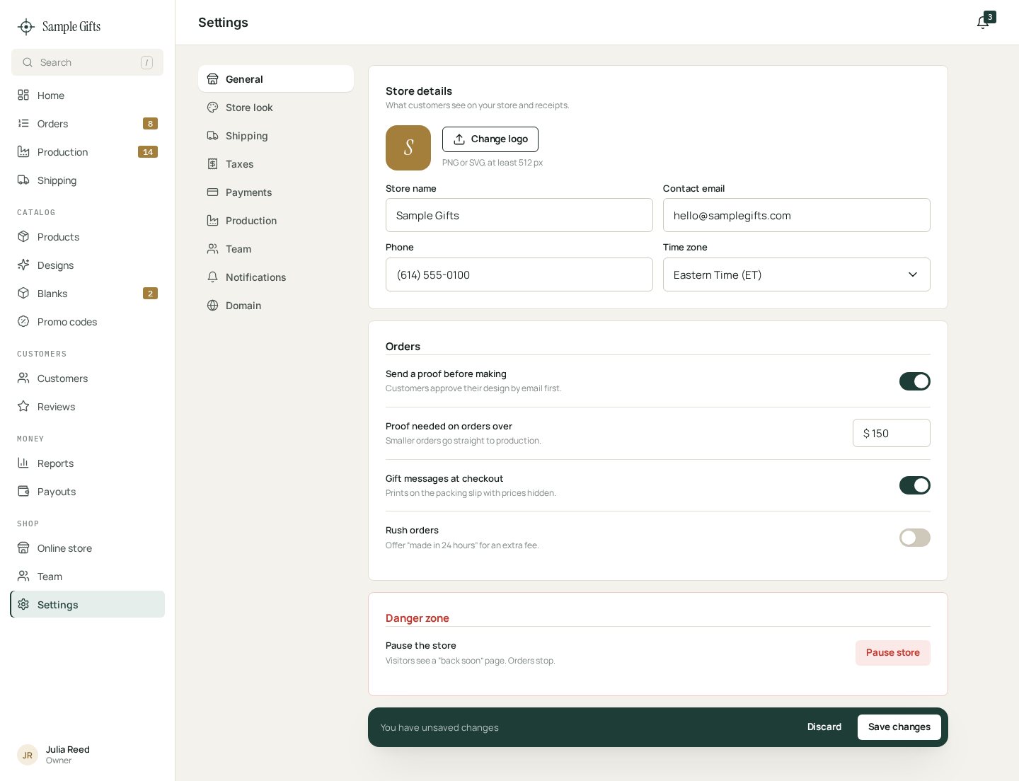
Settings
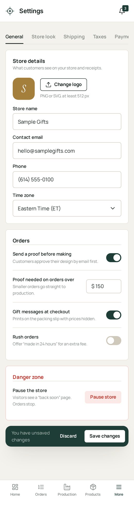
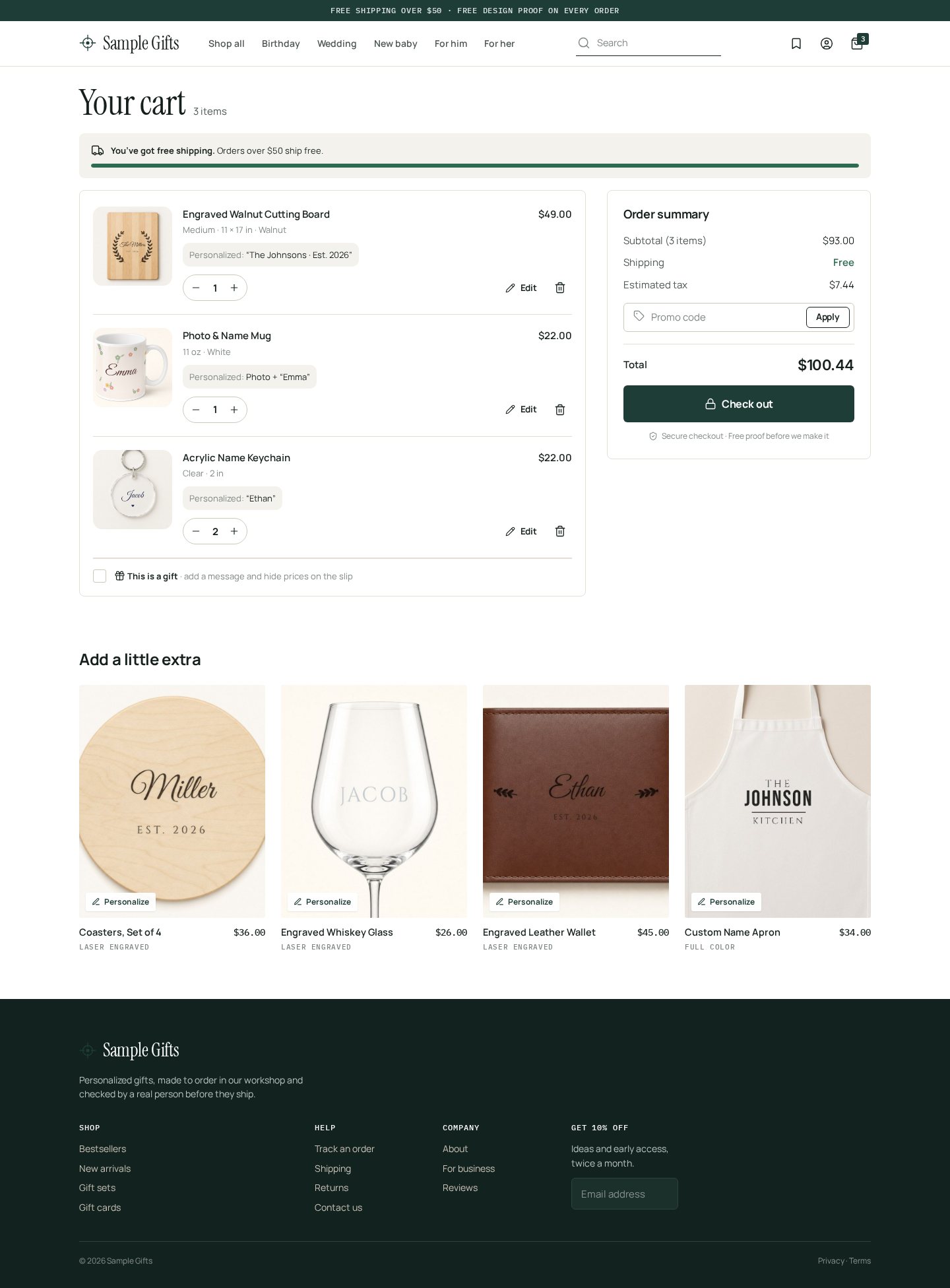
Cart

Category list

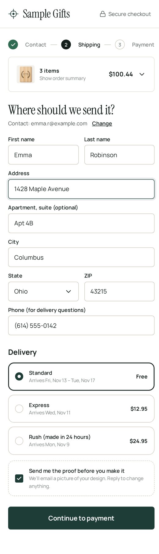
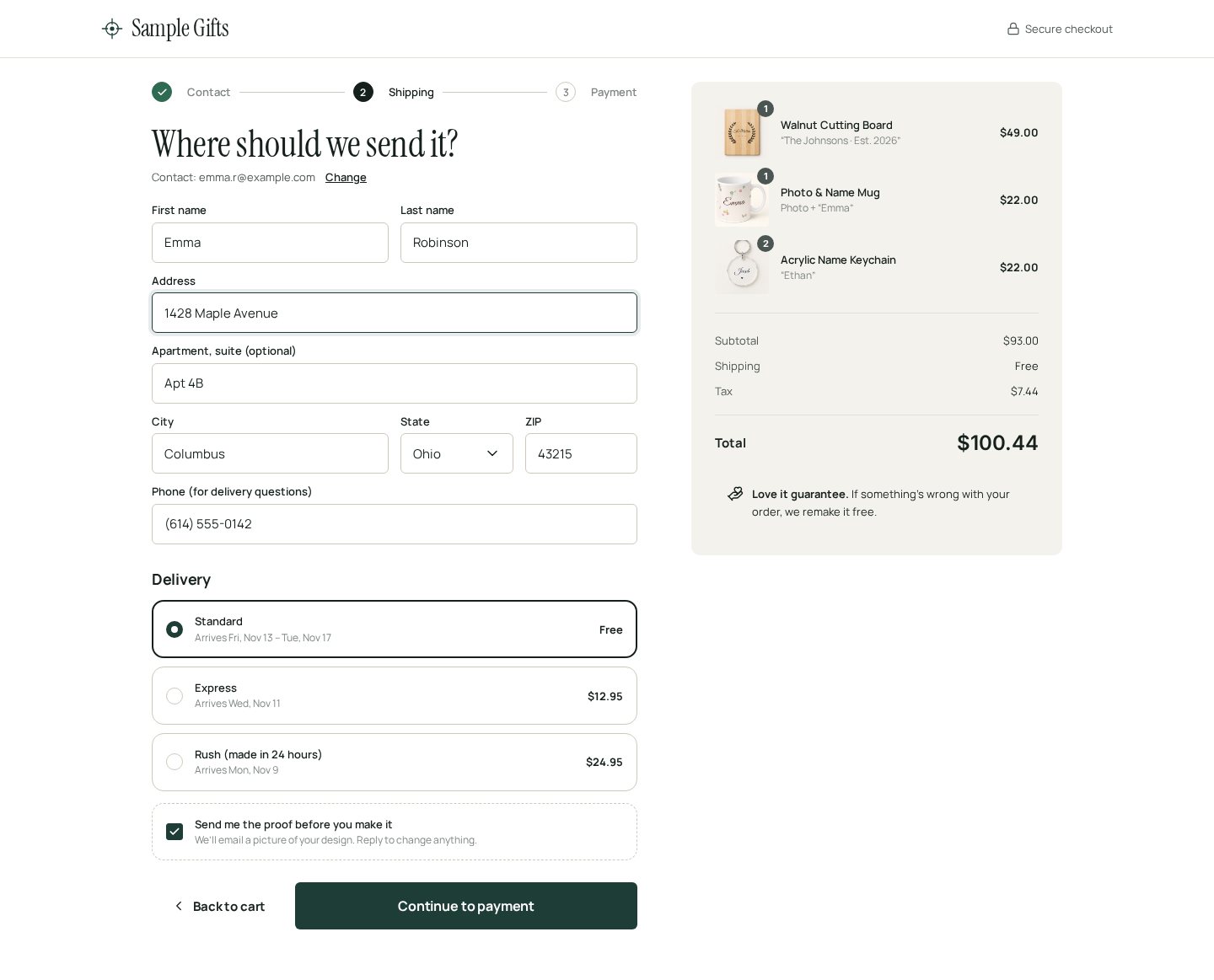
Checkout
Buttons & components

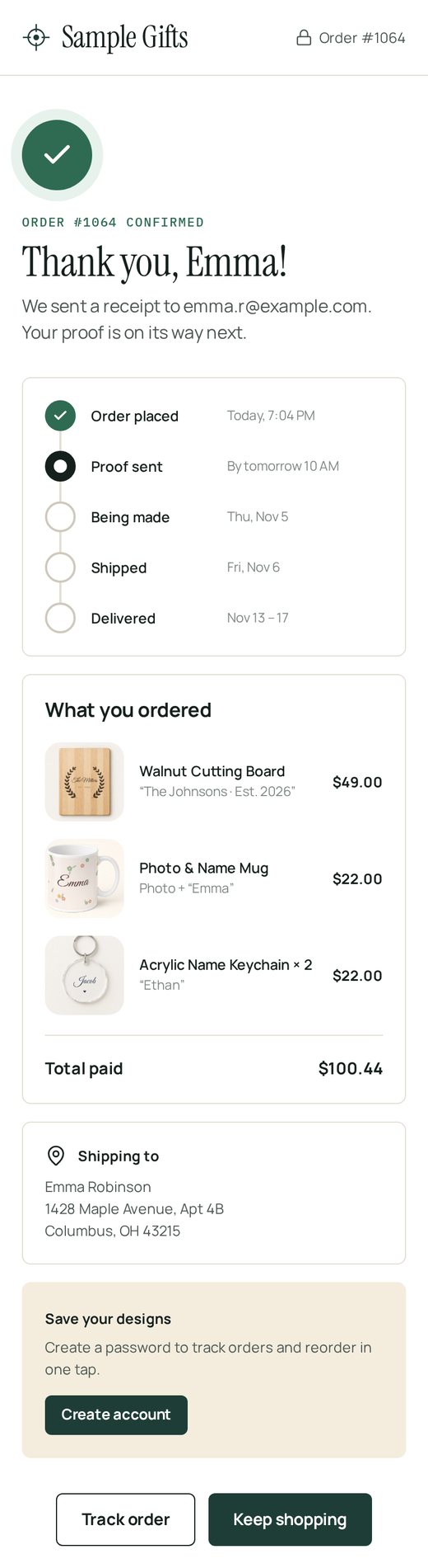
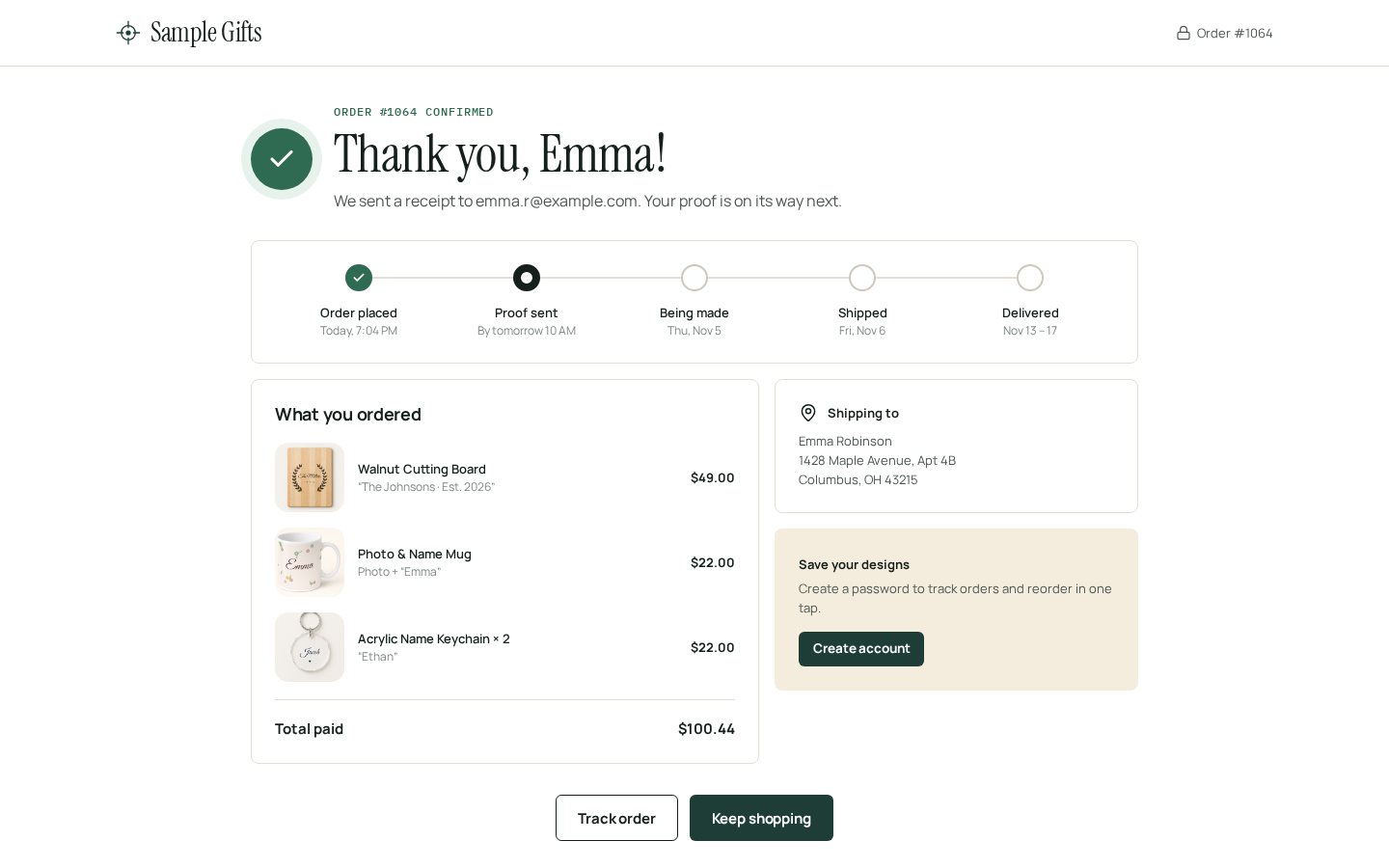
Order confirmation
Storefront home

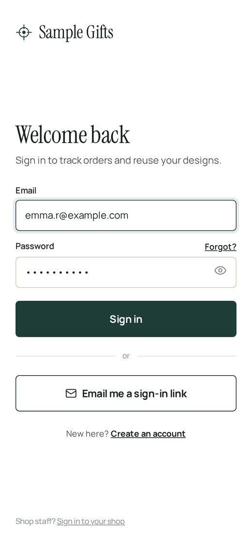
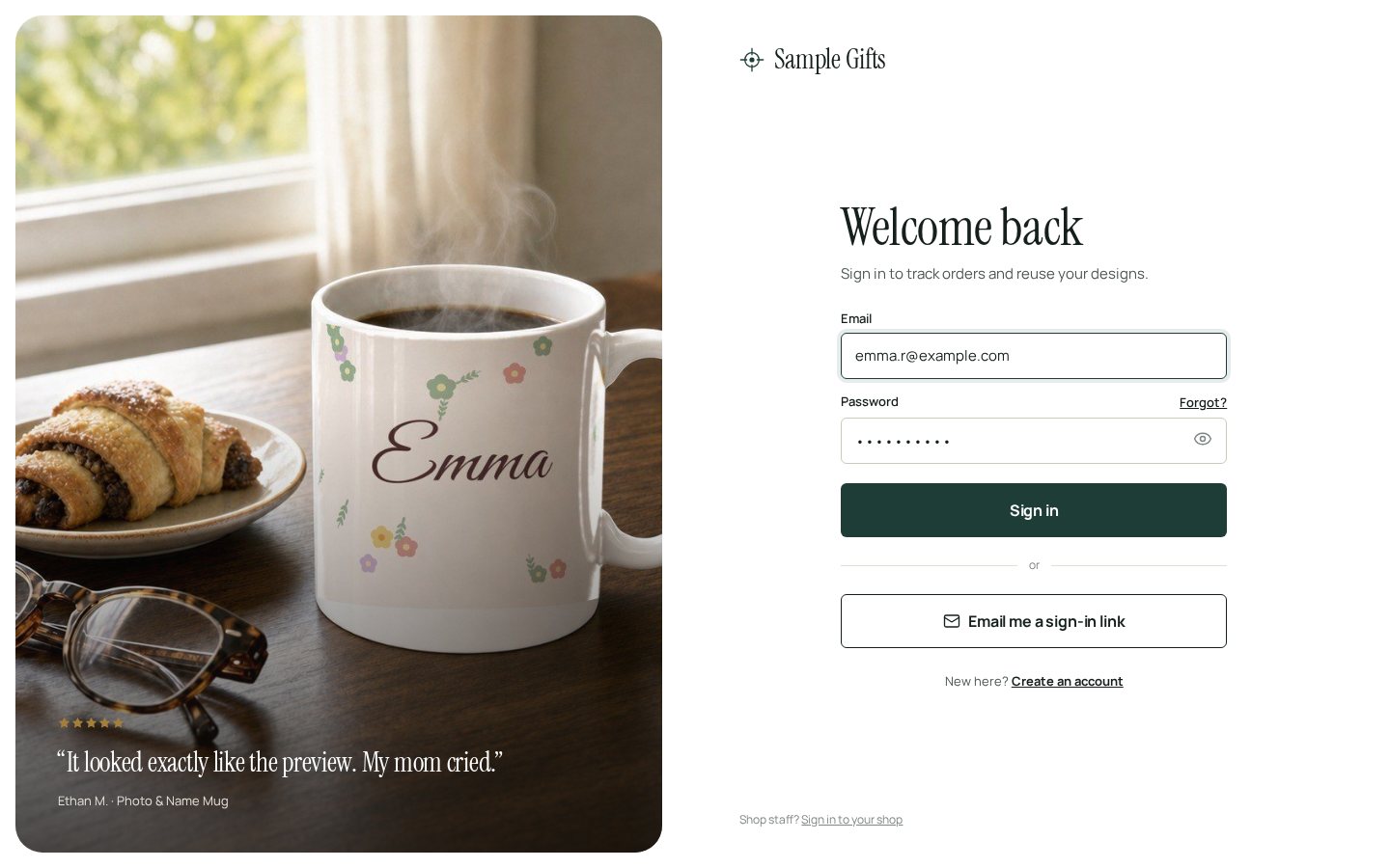
Login
Personalize editor
Product page

Production / workshop
Previous A (and Look B)
The first version you saw, with notes on today’s screens. Kept here so you can compare.
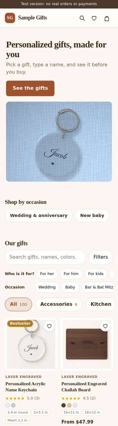
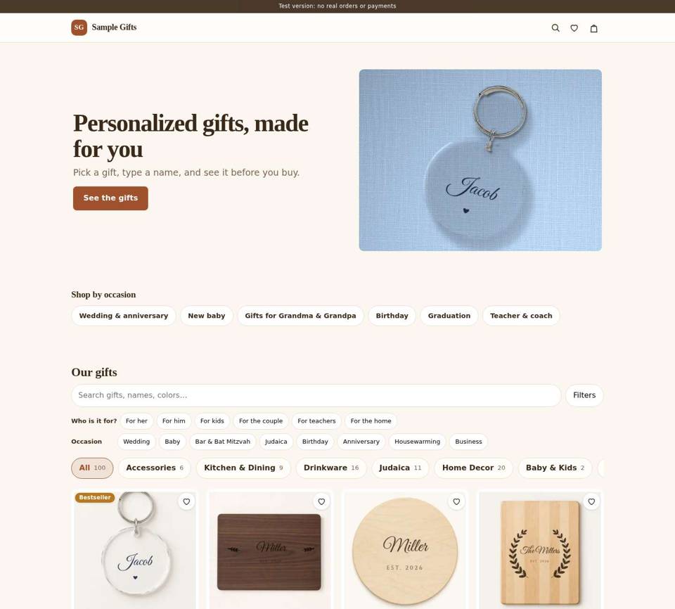
Storefront home
- Headings fall back to a default system serif, so it reads like a 2005 blog, not a brand.
- About 14 filter chips in 3 rows sit above the fold before any product.
- Pinkish-beige page color makes the product photos look muddy.
- Meta text is 12–13 px and gray on beige, hard to read on a phone.
- No clear story: no trust strip, no how it works, no occasions, no reviews.

Show today’s screen
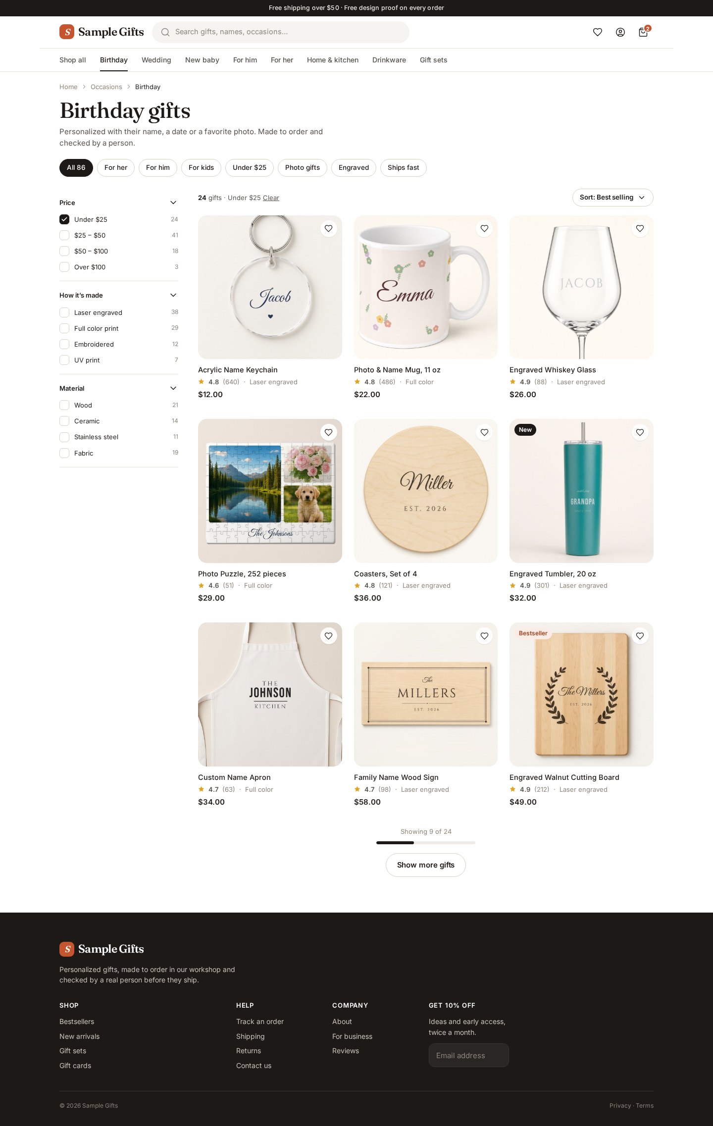
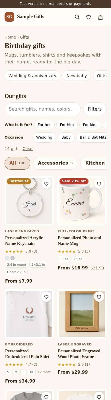
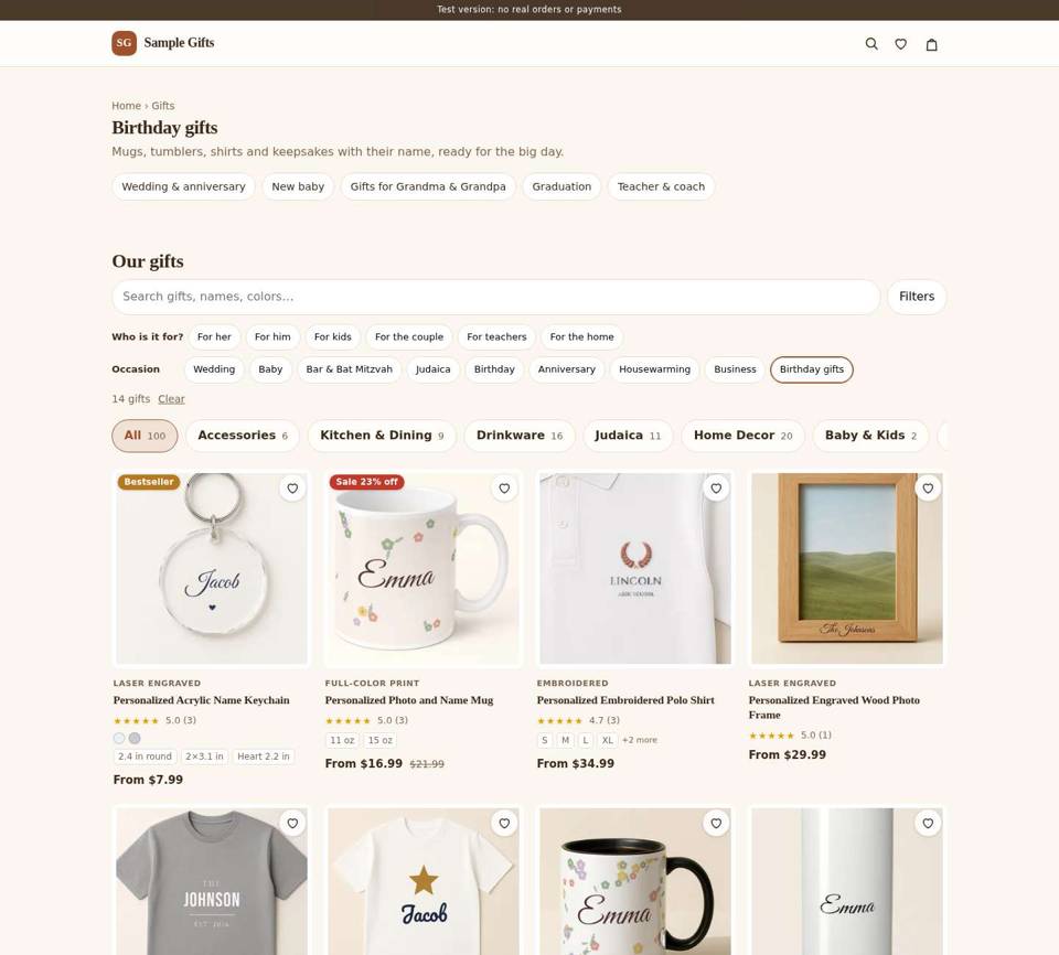
Category list
- A category is the home page with a chip ticked, with no title, count or sort.
- Cards stack 4 lines of tiny meta (method, stars, badges) under every photo.
- No filters on desktop, and no "Show more" rhythm.

Show today’s screen
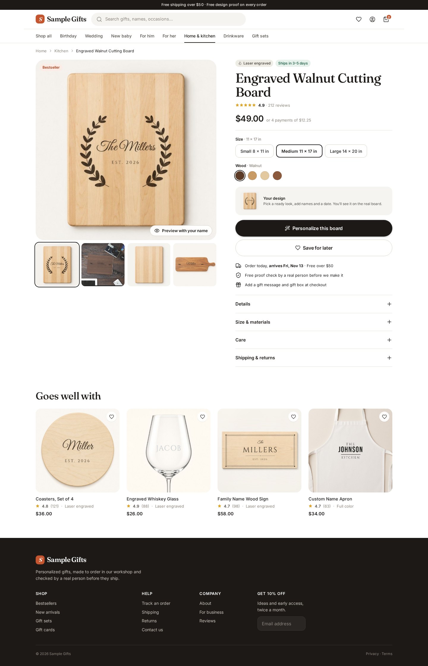
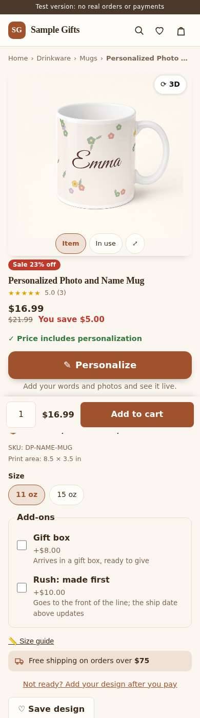
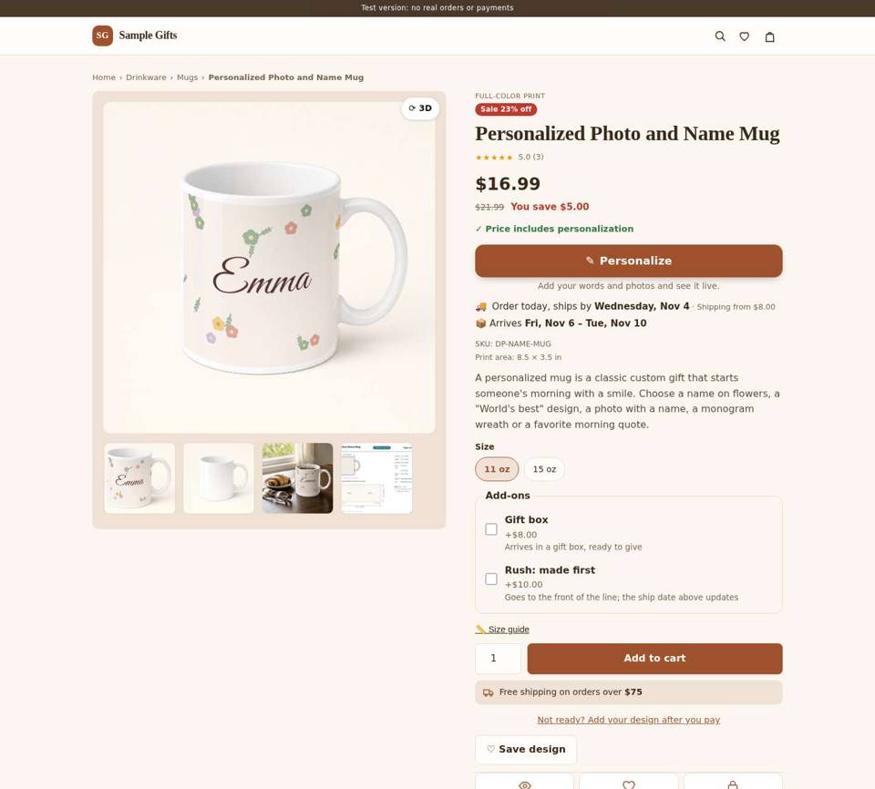
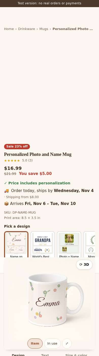
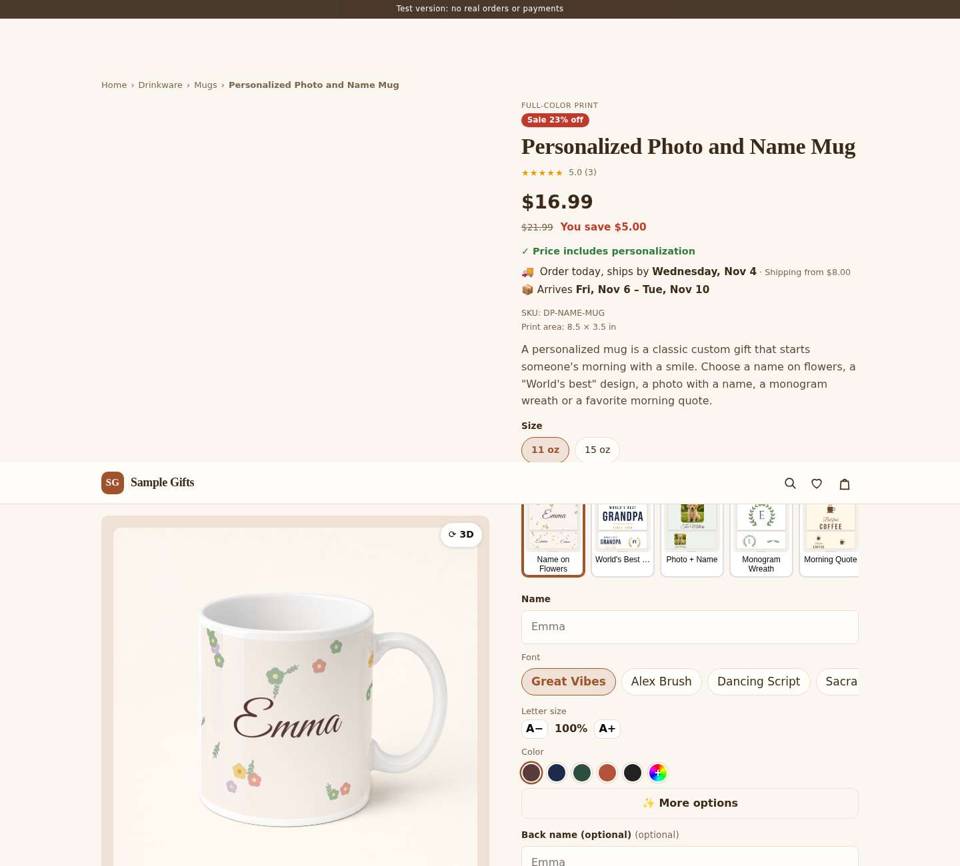
Product page
- Title in the fallback serif. The price is small and doesn't stand out.
- Options are flat gray boxes with no clear selected state.
- Several buttons have the same weight, so "Personalize" doesn't own the page.
- No delivery date or guarantee near the button, and long text walls.

Show today’s screen
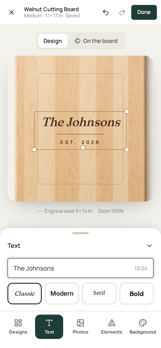
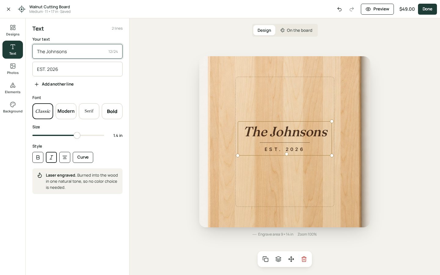
Personalize editor
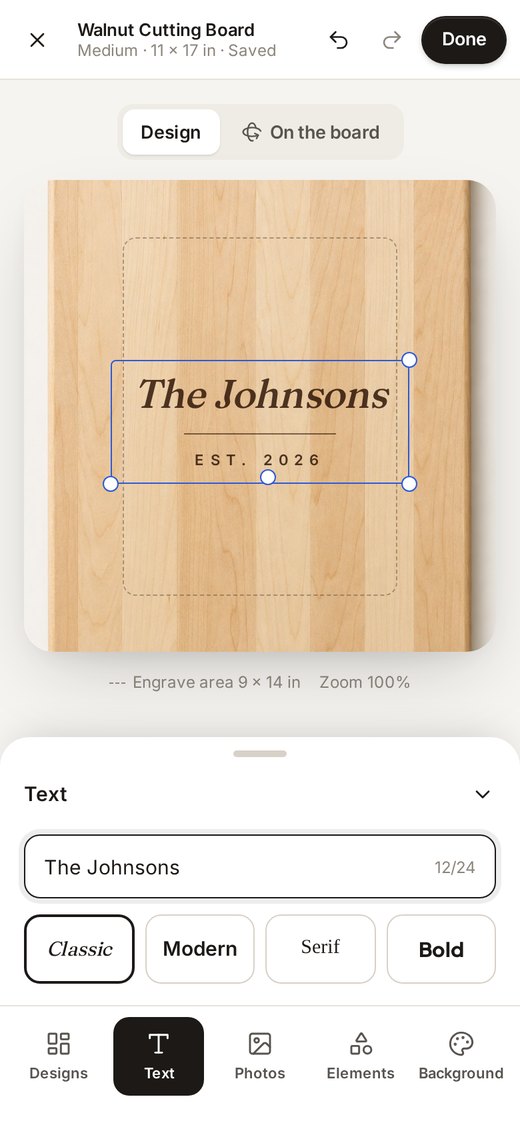
- Tools are text buttons and browser-default inputs. It doesn't feel like Canva.
- No fixed top bar (close, undo/redo, price, Done) and no bottom tool bar on the phone.
- The print area and selection aren't clearly drawn on the item.
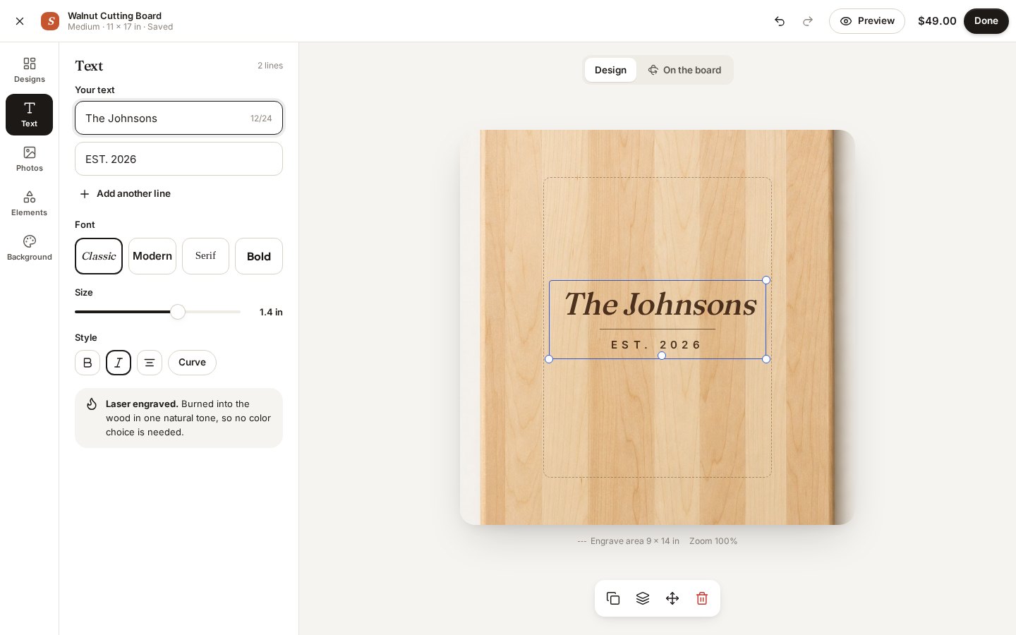
Show today’s screen
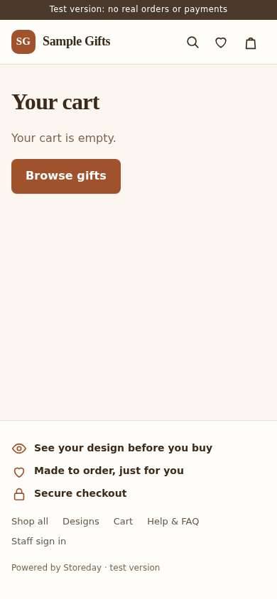
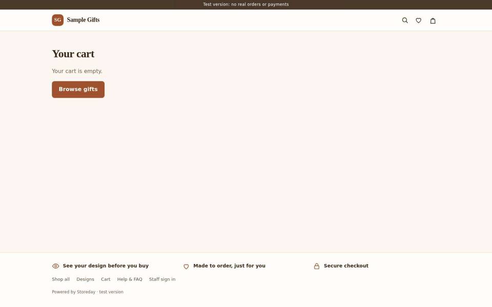
Cart
- The empty cart is a bare line of text with no next step.
- Lines don't show the buyer's design or an Edit button. No free-shipping progress.
- The summary isn't a clear box with one strong Check out button.

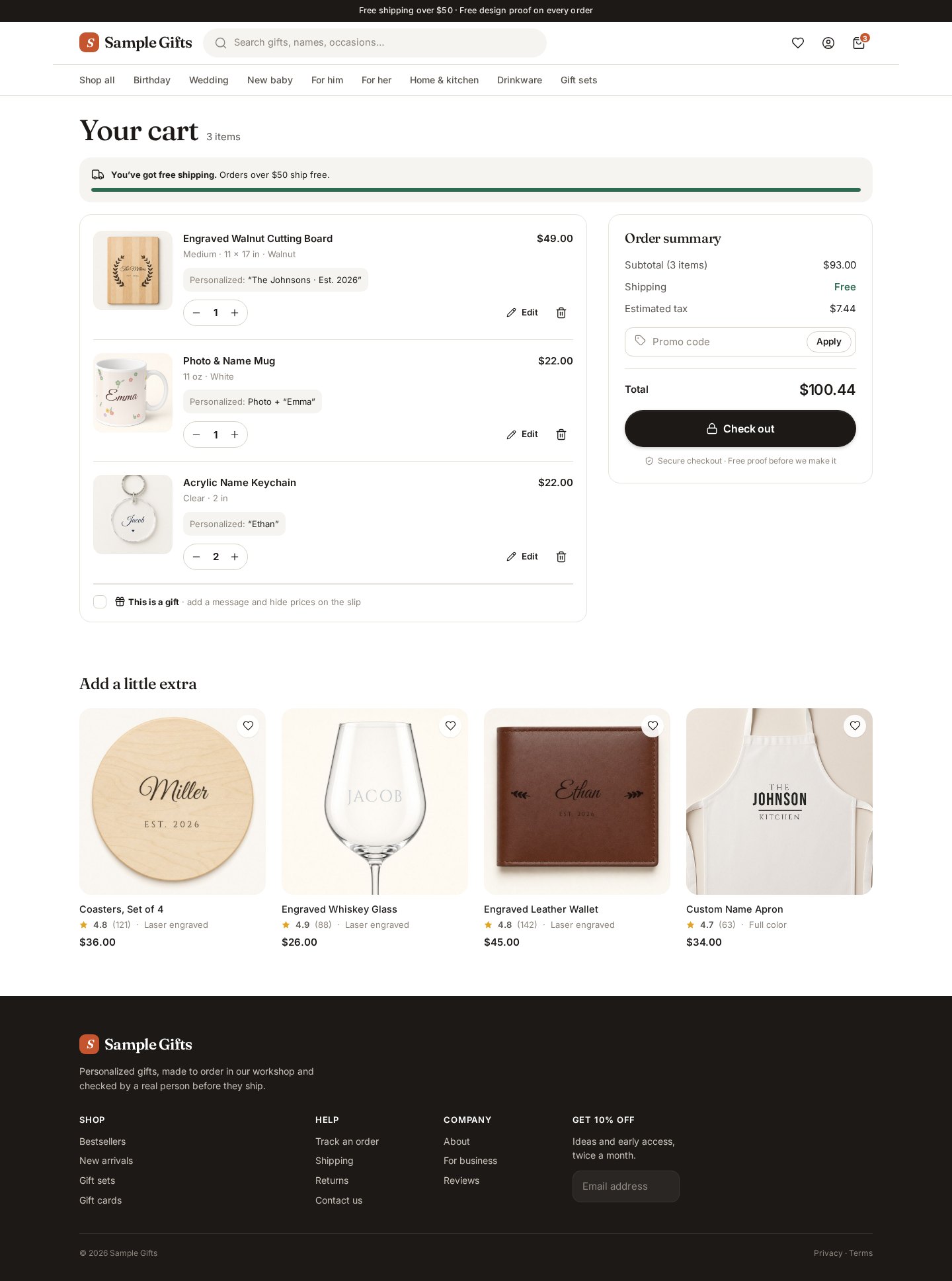
Show today’s screen
Checkout
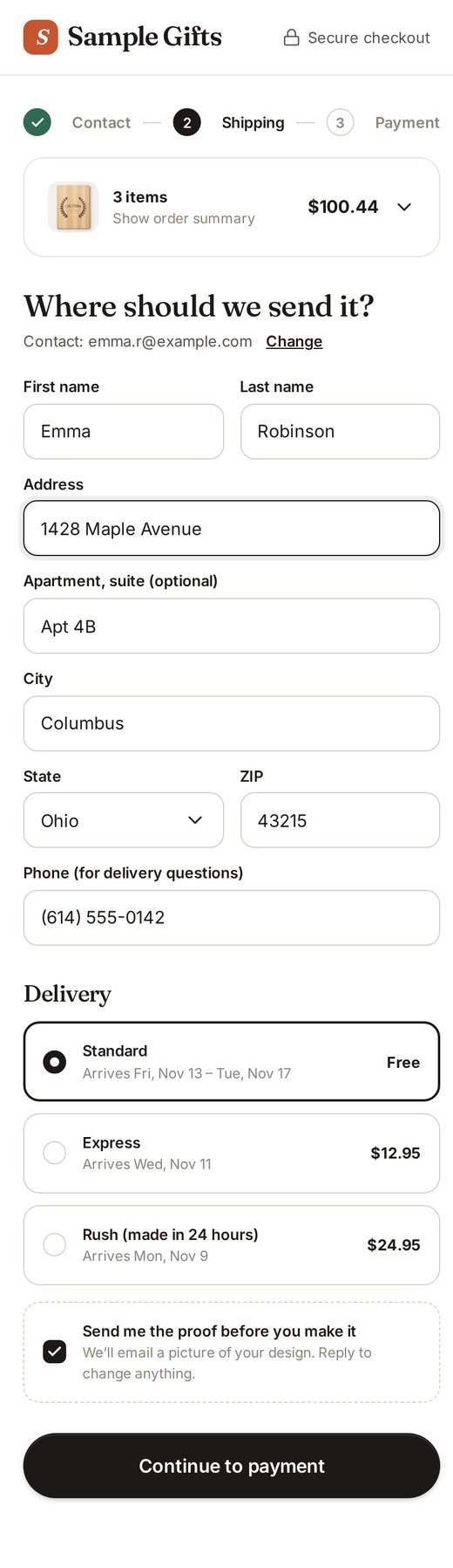
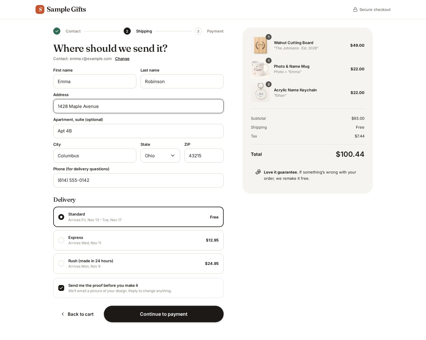
- Default-looking form fields with no steps, no delivery choices as cards, and no order summary beside the form.
- (My capture couldn't reach checkout without a finished design, so this is from the code's current form styles.)
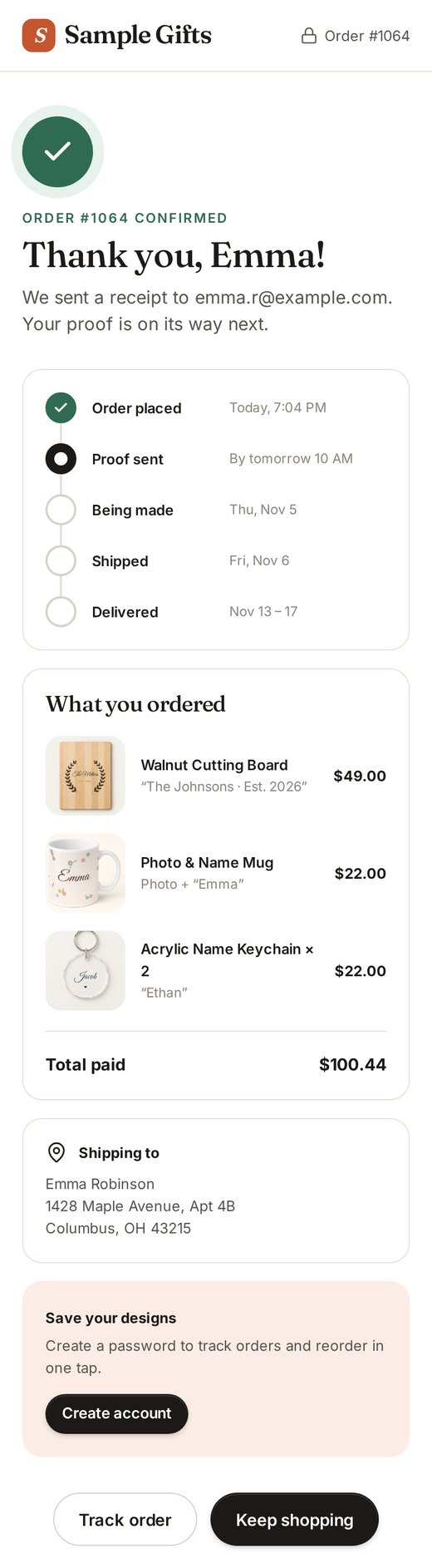
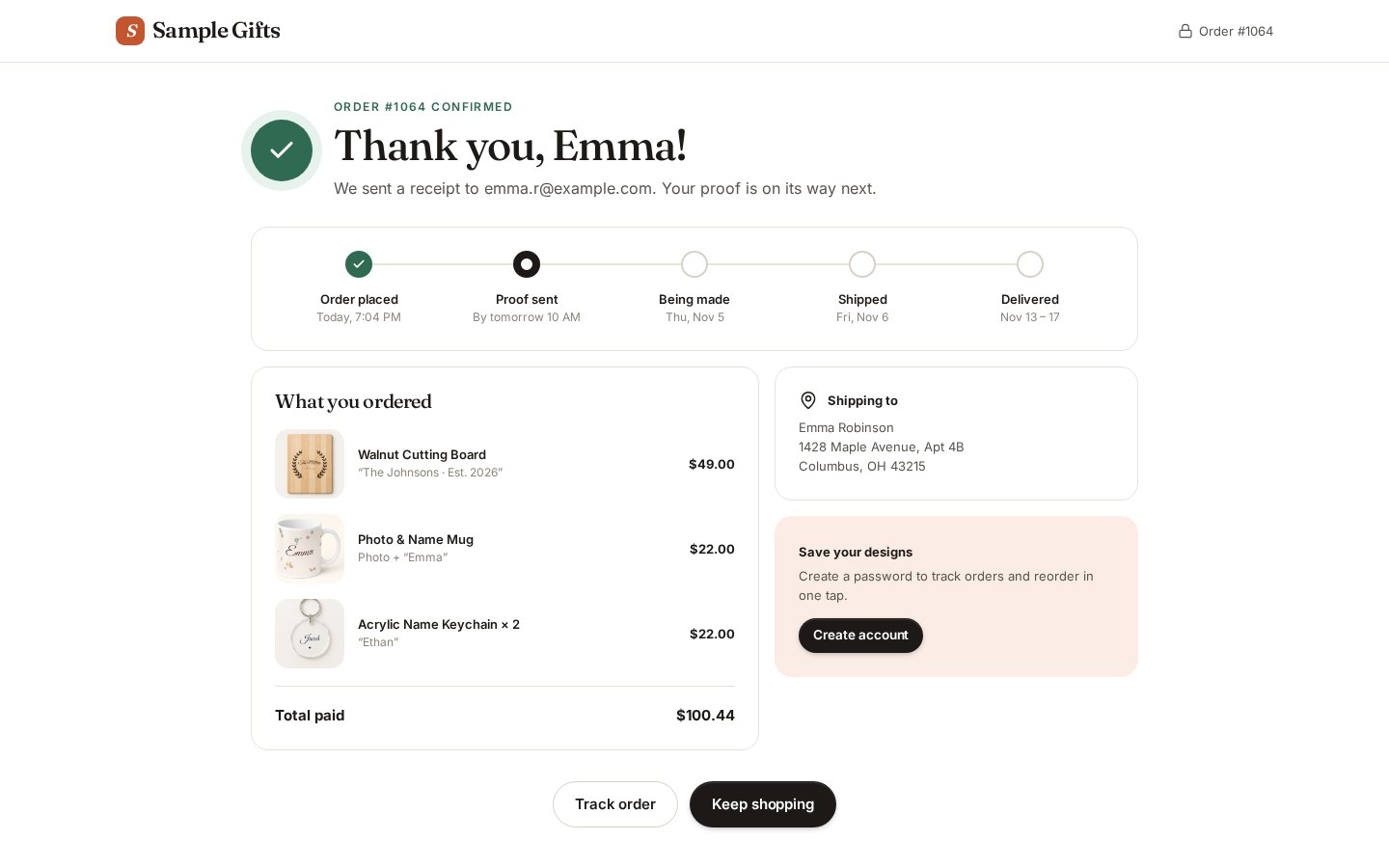
Order confirmation
- No real "it's on its way" moment: no timeline (proof → making → shipped), no next steps.
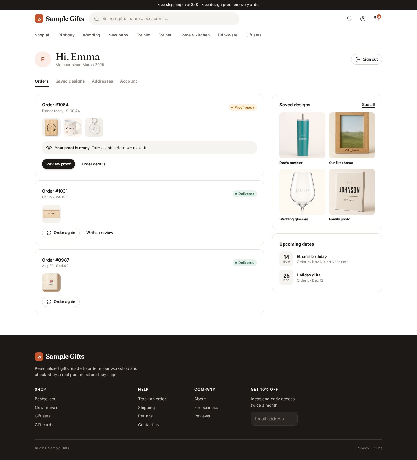
Buyer account
- /account sends you to the login page. There's no designed home for orders, proofs, saved designs and reorder.

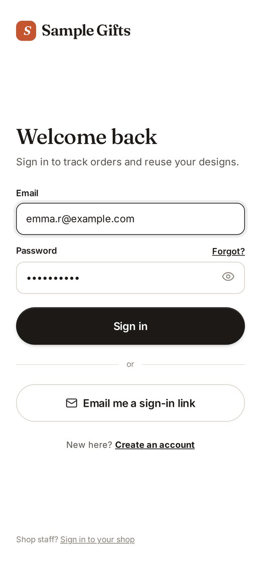
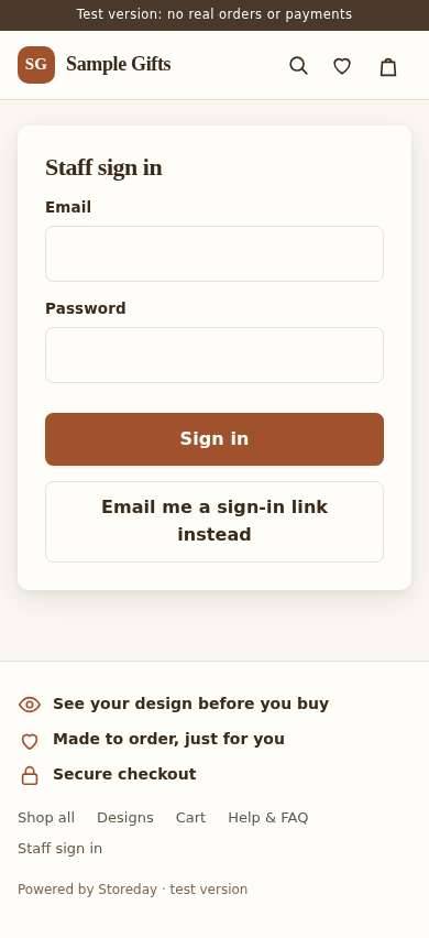
Login
- A plain centered form with no brand, no photo and no reassurance.
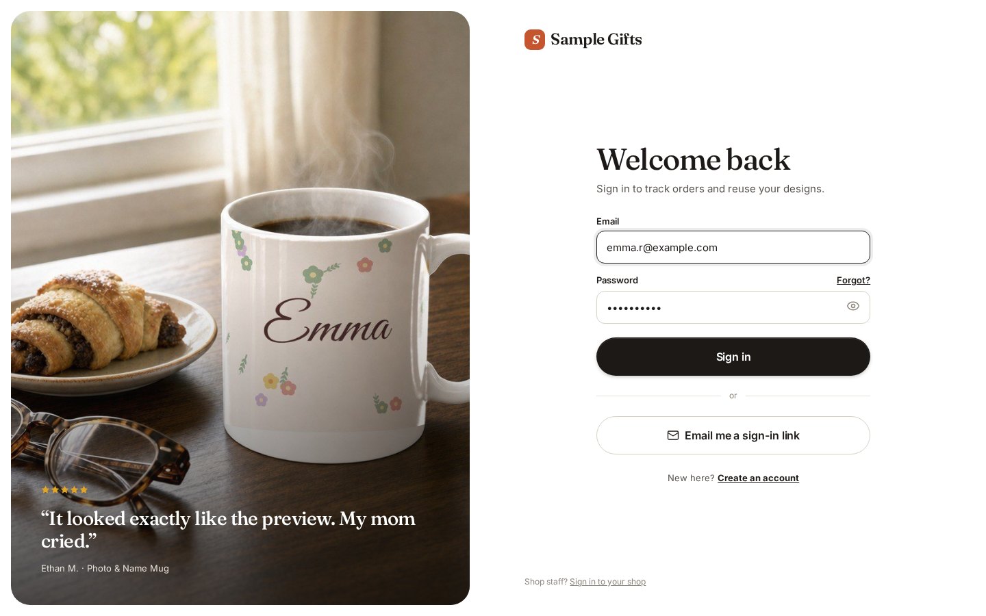
Show today’s screen
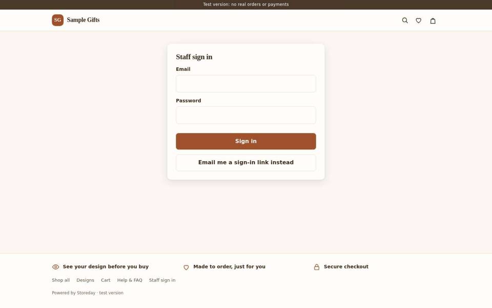
Shop owner home
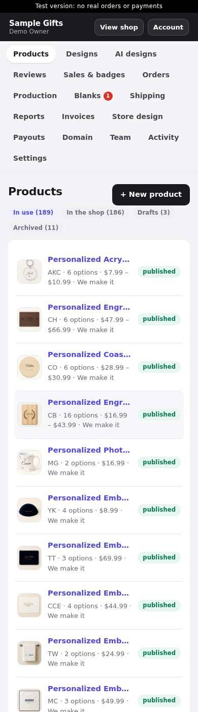
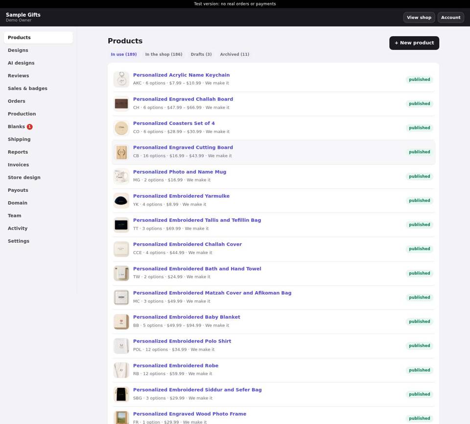
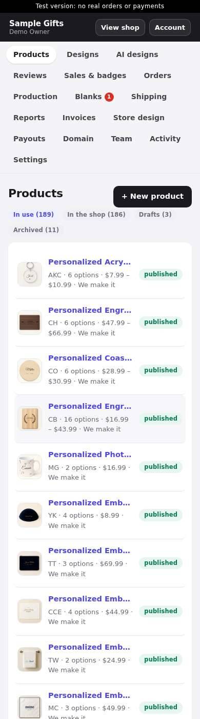
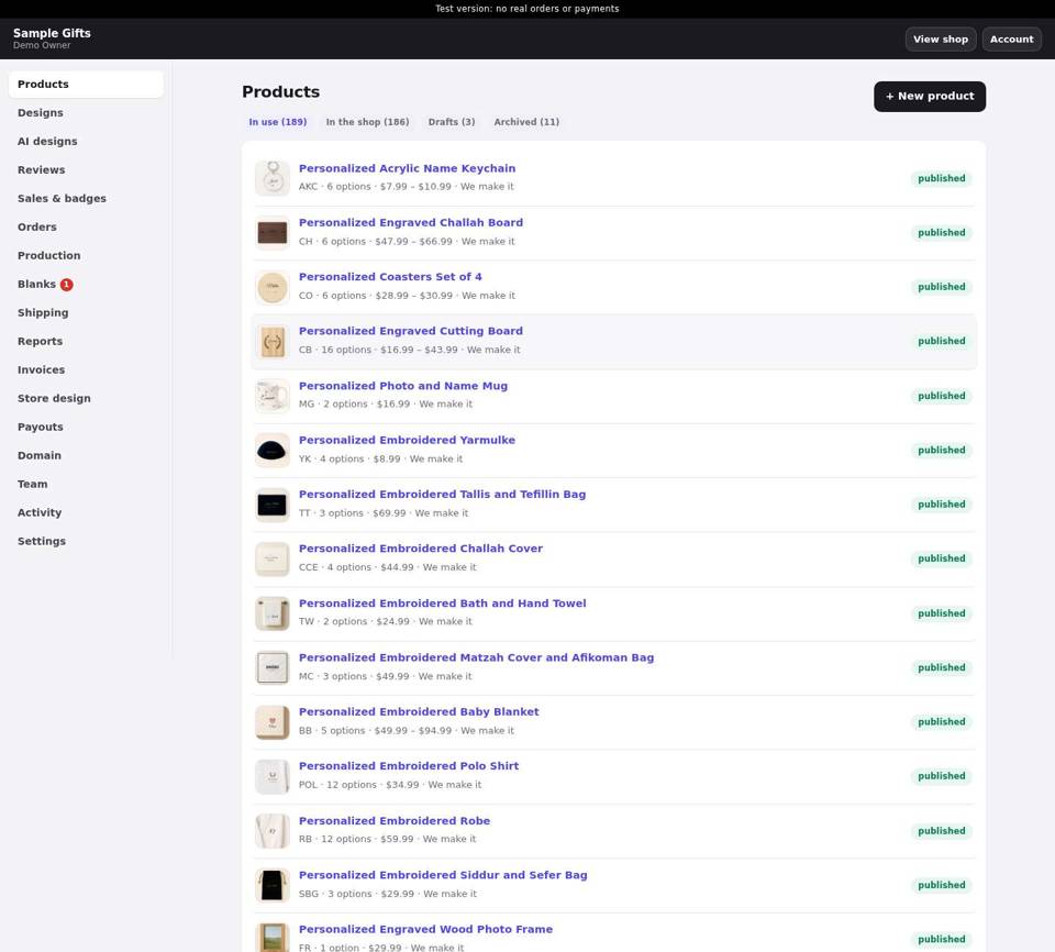
- There is no dashboard. /admin opens the Products list.
- On a phone, 21 menu pills wrap into about 6 rows before any content.
- Purple default links, a gray page and no cards. It looks unfinished.
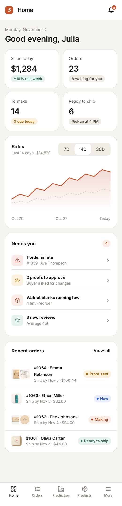
Show today’s screen
Orders
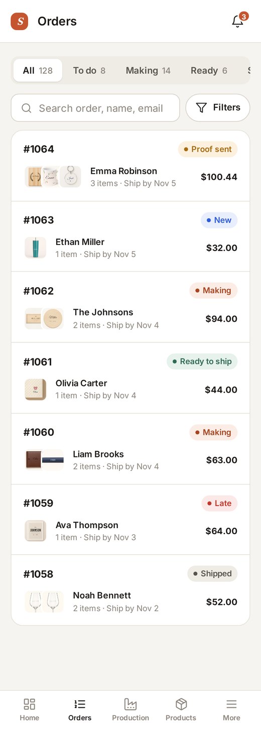
- Raw browser date pickers (mm/dd/yyyy), and filters as a form.
- Rows are text with no status colors, no thumbnails and no bulk actions.
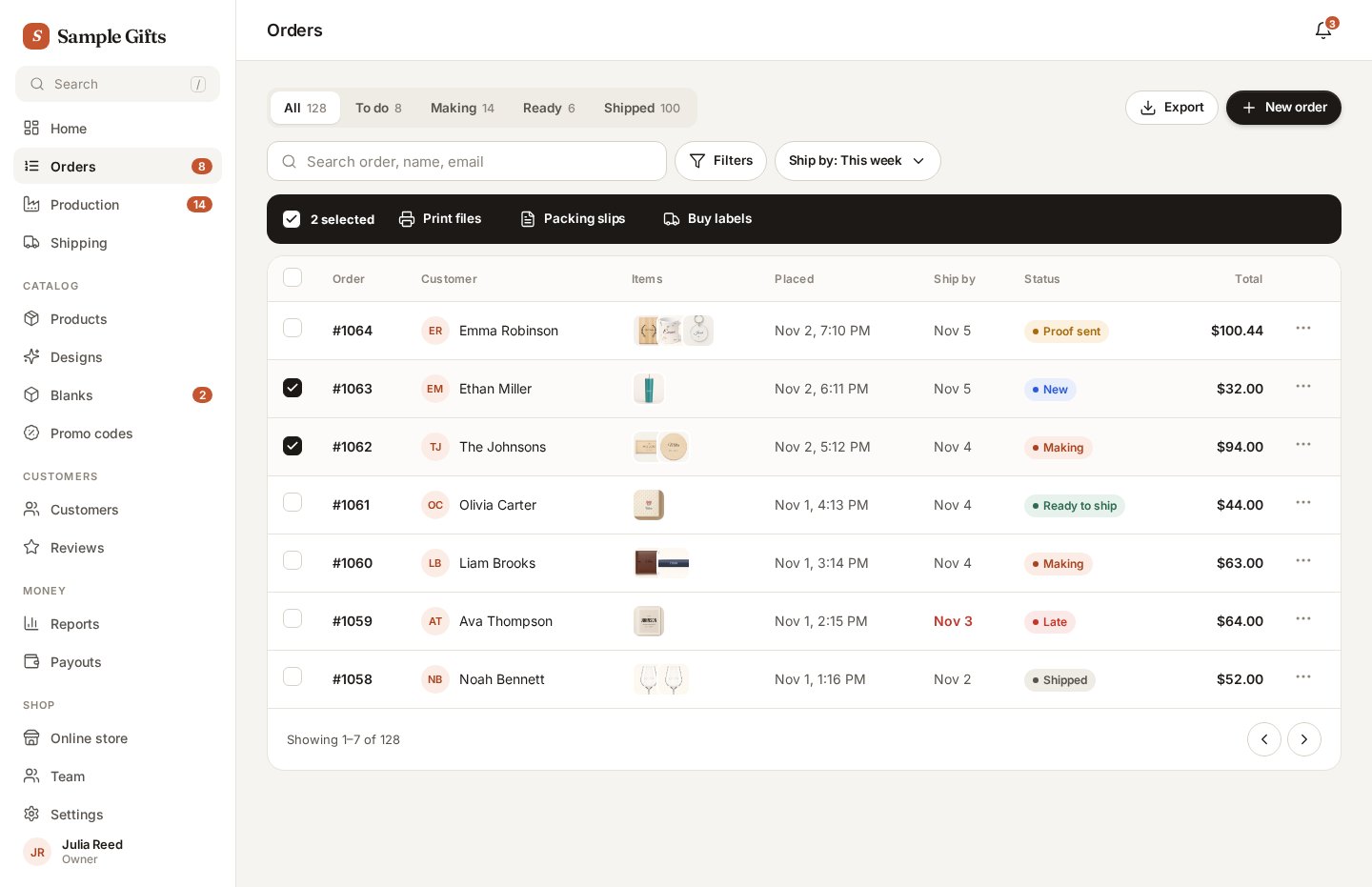
Show today’s screen
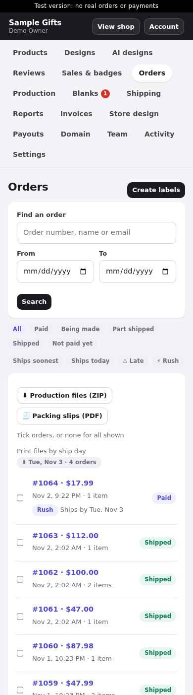
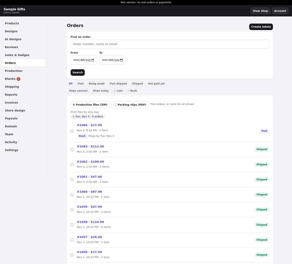
Order page
- One long column where every button has the same weight. Customer, ship-to and payment aren't grouped in cards.

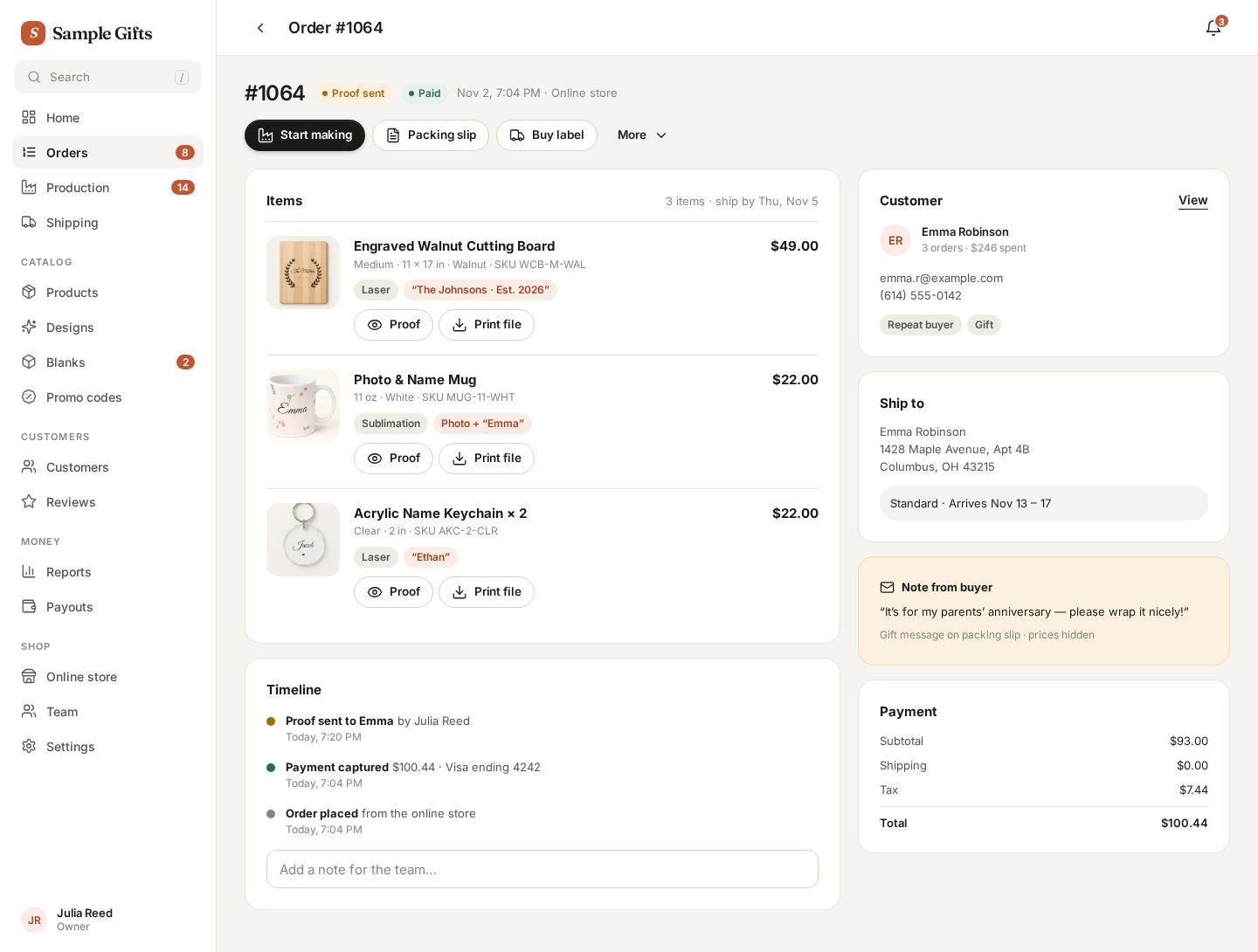
Show today’s screen
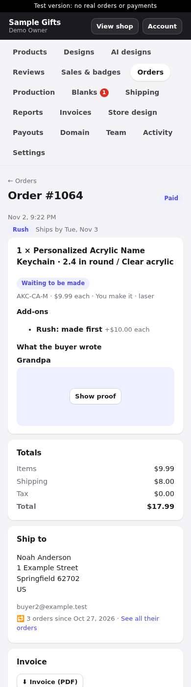
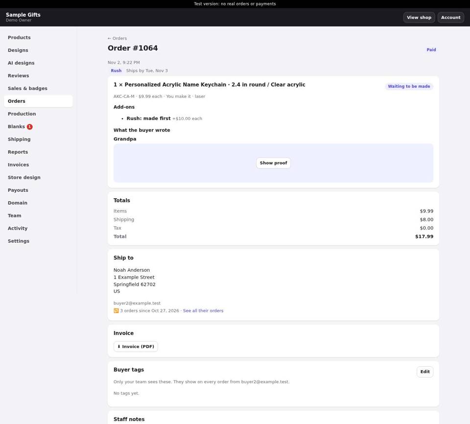
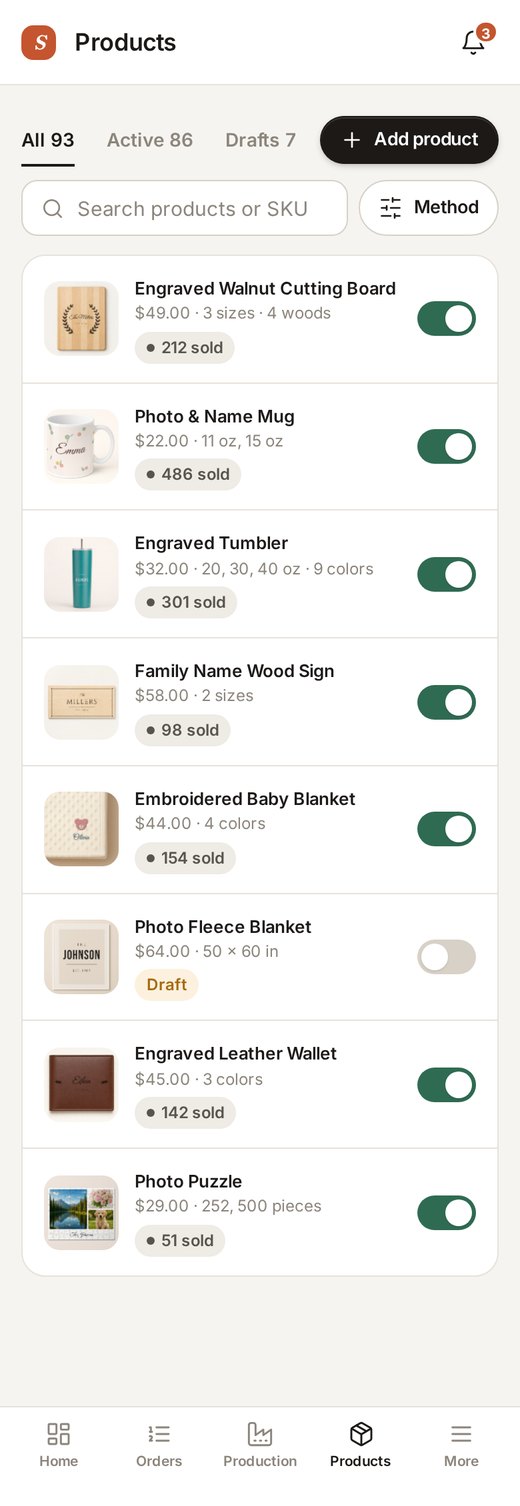
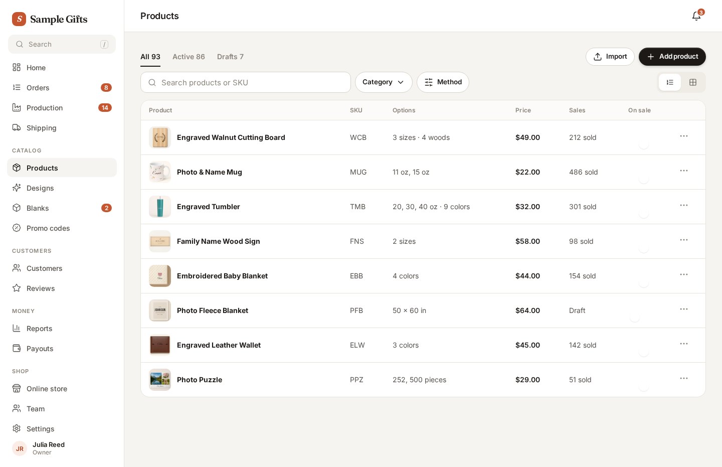
Products
- A plain list with weak hierarchy, no on/off switch and no quick search by SKU.
Show today’s screen
Settings
- One long form with no sections, no side menu and no save bar.
Show today’s screen
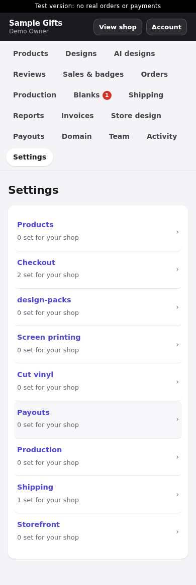
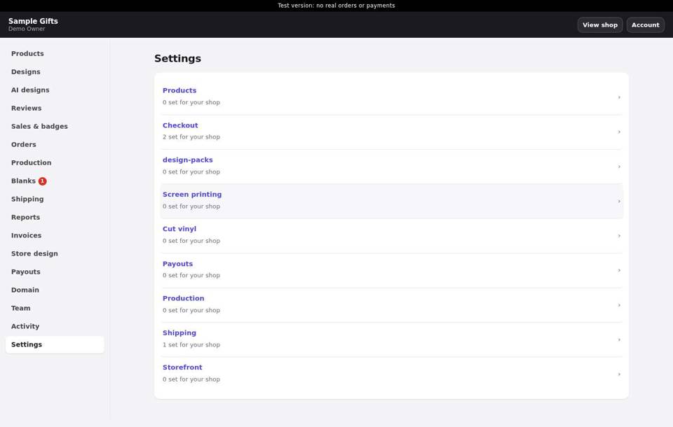
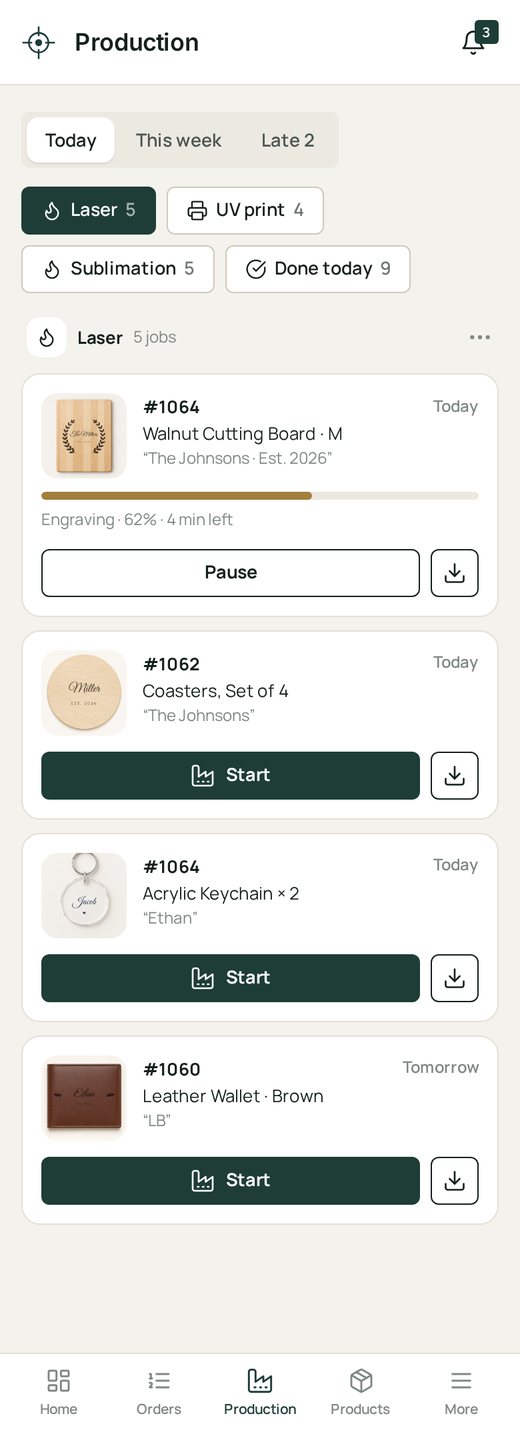
Production / workshop
- A flat list with no grouping by machine, small buttons and no progress or late flags.
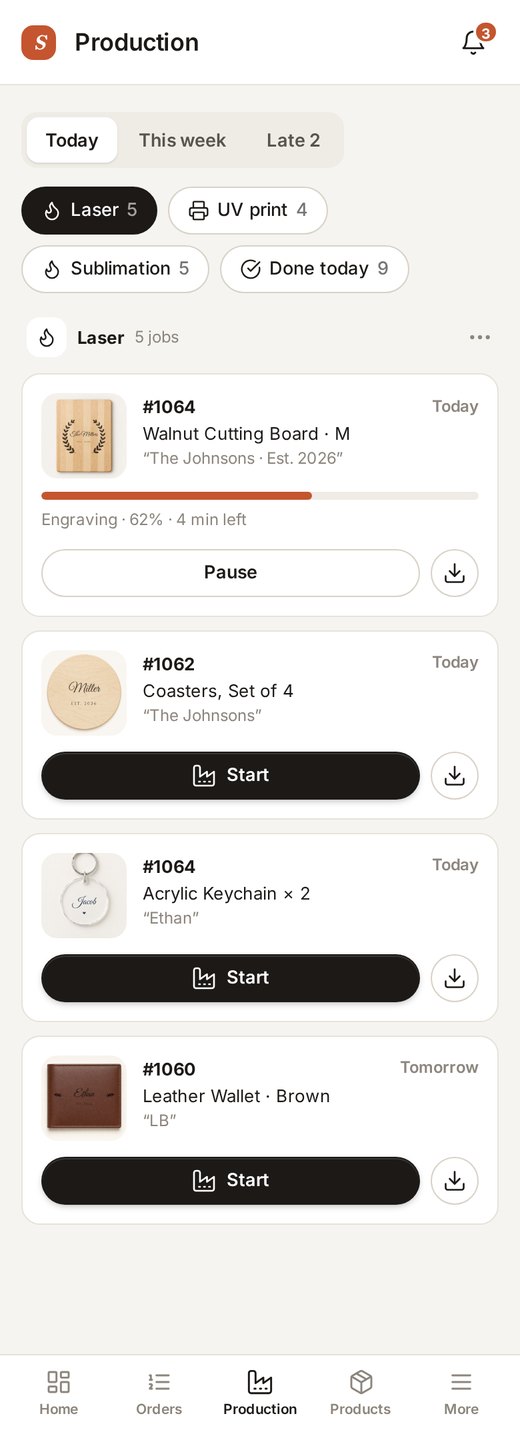
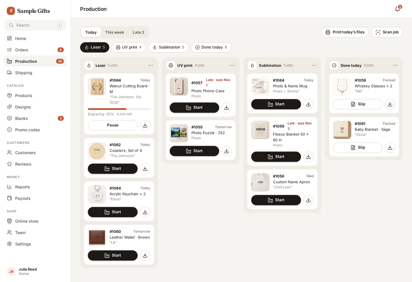
Show today’s screen
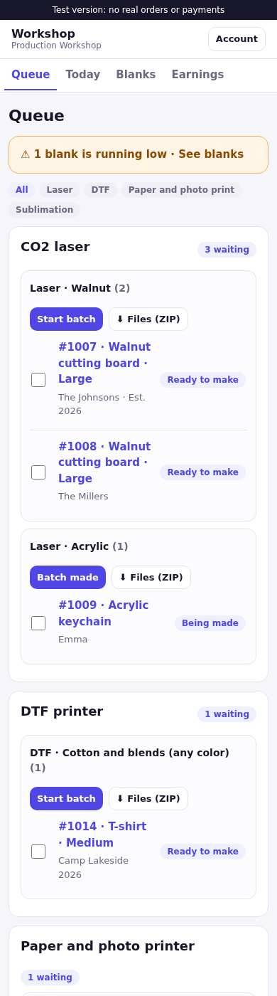
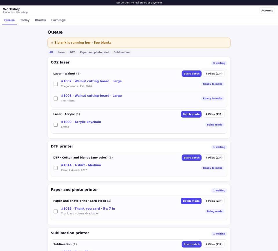
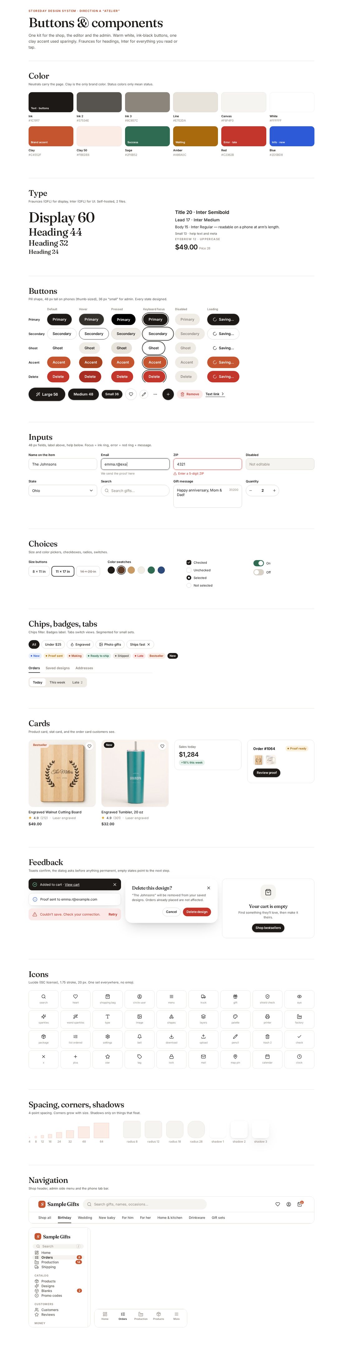
Buttons & components
Every button state, inputs, chips, badges, cards, toasts, dialog, empty state, icons, navigation

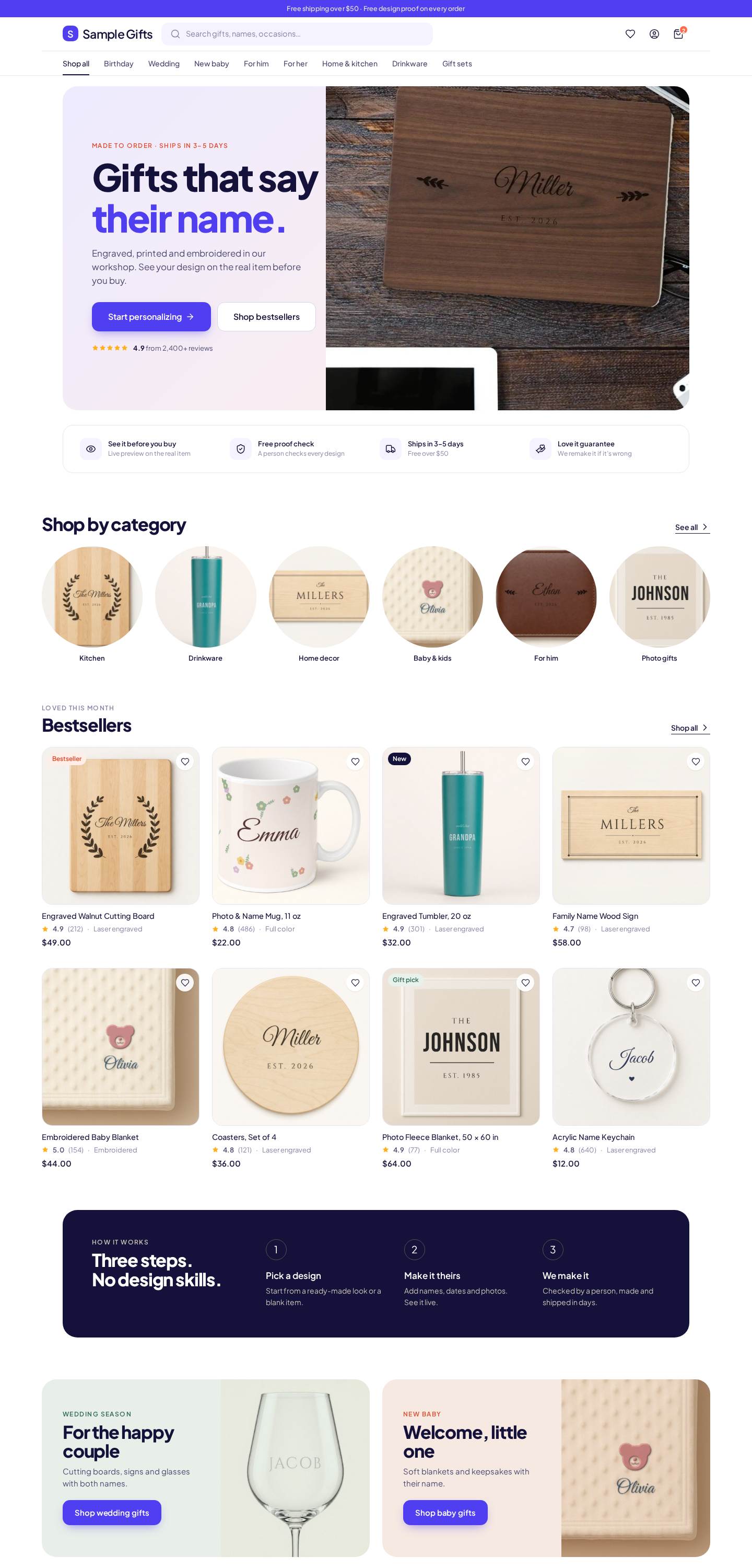
Direction B: “Bright Studio”
Same layout, louder brand. Pick A or B (or a mix).

Fonts: Bricolage Grotesque, Instrument Serif, Manrope, IBM Plex Mono, Fraunces, Inter, Plus Jakarta Sans (SIL Open Font License). Icons: Lucide (ISC). Product photos are the store’s own.